29 February 2008

Shadowy Dragons’ Tails in The Arrival

In his New York Times review of The Arrival, Gene Luen Yang mentioned one striking detail of the early scenes: "Shadowy dragons’ tails haunt the Old Country..." But what do those tails represent?

Publishers Weekly said, "Shadowy dragon tails trawl the sky of the man's homeland, suggesting pogrom or famine..." The Washington Post, on the other hand, saw "the dragon shadow of totalitarianism."

Quiet Bubble suggested:

The drawing doesn’t want us to believe the city actually swarms with giant dragons--in a later full-page spread, as the wife and daughter walk home to the now-empty house, the tails look like shadows and smoke, which doesn’t make them any less threatening. Rather, Tan’s using fantasy in the right way--as a bravura, overloaded way of conveying symbolically the urgency of real-world terrors and hopes. The family isn’t actually beset by dragons, but oppressive governments and societies sure feel monstrous.
As does war. In calling the book one of 2007's Top Five Children's Books Between Cultures, Mitali Perkins described the story "as a young father escaping an unnamed war-torn country in search of a better life for his family in a new world."

Jetse de Vries at In the Plane of the Ecliptic sees the dragon tails as one of the book's "strong indirect autobiographical hints" that it's the story of artist Shaun Tan's own family, his father having emigrated from Malaysia to Australia.

Finally, Piers Kelly at the Compulsive Reader wrote, "The ambiguous reasons for his departure are suggested by sinister and threatening shadows that swirl like dragons' tails along the empty streets."

My own guess: In the course of the book, Tan has his hero take in the stories of a couple of other immigrants. One has escaped from oppression, the other from a war. Though those episodes are fantastic in their imagery, there's not much room for other interpretations. I suspect Tan wanted to depict all the major aspects of the immigration experience, and I don't see such immediate physical dangers threatening the central man and his family. So I think the dragon-tail shadows represent the threat of want, spurring the man to migrate for new opportunities.

In other words, The Arrival asks us to feel sympathy for not a refugee from violence, but an "economic migrant." That's not so fashionable, so societies create laws against it. But economic migrants are, after all, what most of our own ancestors were.

28 February 2008

Who Should Welcome The Arrival?

Shaun Tan's The Arrival was one of the five titles on the shortlist for the 2007 Cybils Award for Best Graphic Novels for teens and young adults. And that proved to be a problem.

Because we Cybils judges weren't all sure it was for teens and young adults. Or at least for those readers exclusively. We discussed the possibility of naming The Arrival as 2007's best graphic novel for middle-grade readers. It just screams "award-winner": it's beautiful; it's serious; even if it's not strictly speaking historical fiction, it has historical resonance; it leaves us with a "sense of hope." It's one artist's vision, not a shiny corporate product.

But The Arrival wasn't nominated in the middle-grade category. After we raised the question of age range, we learned that the organizing/nominating committee had already had long discussions about how to categorize this book. In the end we respected their decision.

After all, those organizers had checked with The Arrival's US publisher, Scholastic, which markets the book for ages "12+". Amazon and the ALA have put it on their lists of best books for teens (though other authorities have said it's simply one of the year's best books for children). For another insightful perspective on this discussion, see Dave Elzey's "what was i thinking? notes of a cybils judge".

All of that thinking raises interesting questions about how to determine the reading level for a wordless comic. Extrapolation says that almost anyone should be able to read them. Fewer words = younger readers. Shorter words = younger readers. So no words at all = ?

Of course, not having any words to guide us makes The Arrival harder to read, not easier. Indeed, making us struggle to interpret a strange world is how the book coveys the immigrant experience. It also demands some knowledge of history and population movements. So perhaps teen readers are the right audience after all.

On the other hand, The Arrival's underlying story, once decoded, is very simple. It's a cycle: one immigrant finds a place in a new society, and ultimately his daughter welcomes another. The protagonist never seems to face problems that last more than a page spread. For all its strangeness, he's found himself in a very friendly world. Even the strange creature infesting his new apartment...
...turns into a pleasant, helpful pet.

The Arrival simply doesn't have the levels of plotting, characterization and tone of The Professor's Daughter, which was our top choice for teen graphic novel. Tan's book was one of my top choices in its age category, but not the top. So perhaps it would be better for younger readers.

But would those readers relate to a protagonist who's a grown man rather than a child? I actually don't think this should be a big problem. The first pages establish that that man isn't just any man: he's a daddy. I bet young readers would have an immediate feeling for a parent going off to work and hoping to see his child again. Throw in the funny pet and the daughter's role in closing the cycle, and I think The Arrival holds plenty of emotional meaning for younger readers.

I think the real challenge for The Arrival is not being mistaken for a picture book. It looks an awful lot like one, with its oversized trim and its many pictures. So parents might be tempted to treat it as a story they can read aloud to a child in one sitting. That won't work. The book's four times as long as the usual picture book. And how does one share a wordless book with a child?

The Arrival demands--and deserves--a new approach. Instead of reading the text together, an adult and child probably have to discuss the pictures. They can take turns narrating what's happening on the pages with many drawings, or picking out favorite details in the two-page cityscapes. They can track visual motifs through the book. They can talk about their own family histories. They can puzzle over mysterious pages--like a whole page spread of small pictures of clouds--without the adult having all the answers. (My best guess: Each cloud shows a day passing on the protagonist's voyage.) The Arrival has chapters: it doesn't have to be read in one sitting.

Of course, I don't have an elementary/middle-grade child to experiment on. So I might give copies of The Arrival to different families and monitor from afar.

27 February 2008

Interpreting The Arrival

Shaun Tan designed The Arrival to look like a weathered scrapbook. The paper-over-boards cover shows a fraying leather binding. The tones of the interior art are muted to sepias, their lines blurred, all to recall photographs from a century ago.

As this sample from New York magazine shows, many of those images are reminiscent of photographs of Ellis Island in New York harbor. Indeed, Tan writes in his author's note of studying pictures of immigrants arriving there from Europe.

Interestingly, Tan himself is Australian, not American. Like his main character, he appears to be from Asia, not Europe. Apparently the Ellis Island experience not only stands for all US immigrant experiences, but carries similar resonance in some places overseas.

The book opens with a page of small drawings of household objects that any reader would recognize: an origami bird, a clock, a cooking container, a child's drawing of her family, and more.
The pictures then follow a man as he leaves his family and boards a steamship, eventually arriving in a strange harbor.

And strange the book becomes at that point. Everything appears in unfamiliar forms, from the immigration authorities' uniforms and examination instruments to this society's writing system and modes of transportation. Even the animals and vegetables are like nothing we've seen before (though they're shaped oddly much like each other).

All this comes at us in a series of sequential images, somewhere between that album of snapshots and the well defined panels of a traditional comic. There are no word balloons or captions. What labels and writing appear in the images are unintelligible to us.

That lack of words and explanations plunges us readers into the immigrant experience. We watch the man walk down the street, a street in a strange world. He doesn't speak the language, he holds no currency. As the protagonist struggles to express himself across the language barrier (as shown yesterday), we struggle to follow what happens to him.

The man finds an apartment, though the appliances take a lot of getting used to. He gets a job hanging posters, but he pastes them upside-down because he doesn't know the lettering. Eventually he ends up working on an assembly line; the factory's product, like so many other objects in the book, is impossible to identify.

Occasionally The Arrival breaks for some side narratives, two- or three-page stories of other immigrants. There's a woman fleeing oppression, a man caught up in a war, a shopkeeper with a young son. But we come back to the initial protagonist as the months pass. Finally he is able to send for the wife and young daughter we saw in the first pages.

Toward the end of the book, we see another page of objects from the family's life, the equivalents of the first. But now those objects reflect the flora, fauna, and culture of their new country. They have arrived.

The Arrival was shortlisted for the 2007 Cybils Awards in the category of graphic novels for teens--more about that tomorrow.

26 February 2008

A Few Words on Wordlessness

In The Art of the Comic Book (University Press of Mississippi, 1996), R. C. Harvey states: "A cartoonist is one who creates in the visual-verbal mode of the comics--someone who is a writer-artist. And in the creative processes of the cartoonist, neither words nor pictures take precedence over the other: they blend."

Harvey is expert in cartooning, comics history, and literary analysis, and this is a very good book on the form. However, his attempt to locate the essence of the comics art form in a half-and-half blend of words and pictures is untenable. (Dylan Horrocks has complained that Harvey's adherence to this theory leads him into "some rather asinine critical judgements." I wouldn't go that far, not when I can simply link to Horrocks's essay.)

The most obvious problem with Harvey's hypothesis is that it offers no space for wordless comics. He acknowledges that some exist, offering an example from a daily strip, but treats them as exceptional. Most comics creators and readers would probably say that comics without words and comics with them share more qualities than not. Both are sets of sequential pictures, they usually adopt the same visual vocabularies and techniques, and we interpret them through similar processes.

Shaun Tan's wordless The Arrival was one of the 2007 Cybils finalists in the graphic novels category (older readers division). I think its wordlessness is crucial to how it works, as I plan to discuss tomorrow. Tan even includes an episode about communicating through pictures instead of words:


The label "wordless" seems to mean something different when applied to children's picture books. As Scholastic published Sara Varon's Chicken and Cat in 2006, the catalogue copy labeled it a "wordless picture book." Booklist and The Horn Book echoed that label. School Library Journal called it a "wordless story." But the book contains words, as this detail from one spread shows.

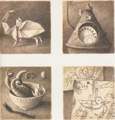
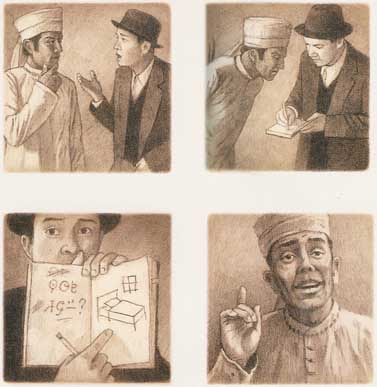
In fact, out of sixteen page spreads in Chicken and Cat, ten contain words. Some are labels on shops, products, or structures that appear in the scenes (e.g., on the seed packets in the picture above). Others are sound effects and motion labels (e.g., "pat pat pat"), as I described back here.

Chicken and Cat got labeled as "wordless" because it doesn't have words where most picture books do. There's no narration explaining the scenes and the transitions between them. As with truly wordless picture books, an adult can't read it aloud to a child. And of course adults need some sort of warning.

Varon's Robot Dreams was another Cybils graphic novel finalist this year. It, too, was described by its publisher as "without words," but again it has a few. Unlike The Arrival, however, that seems simply to reflect Varon's storytelling style; it's not thematically linked to the book's story.

25 February 2008

Models of Magical Law Enforcement

My recent return to the world of Artemis Fowl left me thinking about magical law-enforcement. It's widely recommended that fantasy authors figure out how magic works in the worlds they create, communicate those processes and limits to readers, and then stick to them. So rules of magic are part of nearly all fantasies.

But rules against magic that characters could do but shouldn't are another matter. These, too, have a long history, back to the sorcerer's apprentice and beyond.

Sometimes such laws are given the force of government, as when Princess Ozma of Oz forbids her subjects from practicing magic, excepting only Glinda and the Wizard--and herself--and Dorothy, when she needs to--and her other friends, come to think of it. Hmmm.

Diana Wynne Jones's Chrestomanci is also a magical law enforcer and fixer, though his source of authority is not exactly clear. This is an aristocratic model of government: a carefully educated strong man chosen for his power, passing down his title and property (though not within his family).

In recent years, magical regulation has become more bureaucratic. We met the feckless Ministry of Magic in J. K. Rowling’s Harry Potter series, a branch of the British civil service headed by a politically minded wizard. Harry and his friends get a close-up look at its workings in HP7, when they penetrate its headquarters in disguise, and that book's epilogue tells us that as adults they basically seize its levers of power.

We also encountered an entire magical government of Great Britain in Jonathan Stroud's Bartimaeus trilogy. In these books, wizards don't serve a non-magical Prime Minister but hold the ministries themselves, oppressing the commoners who can't work magic and the genies who actually perform all the spells.

All these models of magical law enforcement involve human magicians regulating other humans. Magical creatures, even sentient ones, basically remain above (or below) any law but nature's. A genie or giant might have to be suppressed here and there, but no one expects magical creatures to significantly adapt their behavior to society. After all, such creatures are basically embodiments of mysterious natural forces.

Which brings me back to Artemis Fowl. In that novel Eoin Colfer shows us all the bureaucratic rivalries and back-biting of the Bartimaeus books, the abject concern for public relations and petty rules of the Ministry of Magic. But in Colfer's world, the law enforcers are fairies themselves. They have natural laws they must follow, but they also have rules they've decided on for their protection and enforce ruthlessly. Far from being beyond human-style politics, they're in the thick of it. No wonder the series leaves some readers dyspeptic.

24 February 2008

Rolling in the Gutters

In book production, the "gutter" is the place where two facing pages meet at the binding. Because book pages rarely lie flat there, picture-book artists and book designers working on full-page spreads learn not to let important details fall into the gutter.

In comics, the "gutters" are all the gaps between panels. Sometimes there's no physical space to a gutter; two panels bump right up against each other. But there's still a conceptual space created by the differences between one panel's image and the next. (To be technical, comics bound in the middle also have the other type of gutter; it can correlate with the panels' gutter or cut right through a panel, in which case we're supposed to conceptually ignore it.)

Comics gutters have acquired great theoretical weight since the publication of Scott McCloud's Understanding Comics, which posits that readers' intellectual act of connecting two images (which he calls "closure") is what sets comics art apart from all other forms. Thus, the meaning of a comics story can actually lie in those empty gutters. Very deep.

McCloud offered a taxonomy of transitions from one panel to another:

  • Moment to Moment
  • Action to Action
  • Subject to Subject
  • Scene to Scene
  • Aspect to Aspect
  • Non Sequitur
Here are examples of each from a McCloud student.

Every so often, however, comics artists insert gutters into what by all rights should be a single panel. Today's weekly Robin is an example of that technique from New Teen Titans, second series, issue 20, script by Marv Wolfman and art by Eduardo Barreto and Romeo Tanghal.

In the drawing below, Wonder Girl on the left contemplates how she's going to lead an ad hoc Titans group she's assembled, including (from left) Aqualad, the third Robin, Speedy, Hawk, and the Flash. In her mind she quotes the group's usual motto/battle cry, "Titans Together."
By dividing what looks unmistakably like a single scene at a single moment into three panels through the tactical placement of gutters, the comic's creators signal that this team is divided. They haven't worked together before. They all have different things on their minds. These Titans aren't "together" at all.

23 February 2008

The Mummy Turns: The Professor’s Daughter

21hkbxs1dgl_aa_sl160_Our mummy monster myth seems to be relatively recent. As Paula Guran's essay on DarkEcho traces, the tradition in English literature seems to go back to Arthur Conan Doyle's stories "The Ring of Thoth" (1890) and "Lot No. 249" (1892), and Bram Stoker's novel The Jewel of Seven Stars (1906). Though other authors, many of them French, had written a variety of fantastic stories about mummies, those three tales from late Victorian London seem to have codified the myth.

In 1932, after Dracula was a big hit, Universal Pictures seized on that tradition to make The Mummy with Boris Karloff. (Hollywood had produced several short movies about mummies in the 1910s and '20s, but those were comedies, not horror adventures.) Other mummy movies followed that one, right through this decade, cementing the myth in our culture.

These horror tales share a basic narrative: Ancient Egyptian monarch or priest is brought back to life, is upset about Westerners raiding his tomb or some other affront, and wreaks more havoc than a dessicated corpse wrapped in cloth should be able to wreak. A recurring plot element is that the mummy seeks his (or, in the rare case, her) lost love, who in an astonishing coincidence is closely connected to the archeologist who did the tomb-raiding. It's easy to read colonialist fear and guilt into that part of the tale.

The Professor's Daughter, the 2007 Cybils Award designee as Best Graphic Novel for Teens, borrows some of that mummy myth and turns the rest of its head. A corpse in bandages named Imhotep IV woos Lillian Bowell, daughter of the scientist who has brought him to London sometime in the late 1800s. The young woman even reminds the mummy of his dead wife. But in this tale Lillian loves him back. And why not? Imhotep's charming and devoted. The only tyrant in her life is her father.

When Imhotep expresses his love for Lillian, Prof. Bowell replies, "You are the property of the British Museum. You are dead. Stay out of this!" Victorian propriety is an important element of the story, the atmosphere to be upended over and over by slapstick action and sudden death.

Imhotep IV and Lillian run away, only to fall into the hands of someone else who wishes to marry her, someone far less gentlemanly than Imhotep IV. That's his father, Imhotep III, also a mummy, but with less well preserved teeth. He's the classic monster: arrogant, angry, and unstoppable.
The plot twists around on itself like a long bandage. There are jail breaks and dream sequences and murder trials and imprisonment in the Tower of London. Queen Victoria herself makes an appearance as the older mummy seeks a mate worthy of his rank.
In fact, though we root for Imhotep IV and Lillian to gain a happy ending, I think Imhotep III eventually carries away this story. In his own brutal way, he wants the best for his son as well as only the best for himself. He's also ruthless, killing at least two men, probably many more. But of course a story about mummies has death running through it from the beginning, doesn't it?

All but four pages of this book have the same layout of six equal-sized panels. (There's a reason for each of those four deviations from the pattern, in two cases important plot turns.) The art's lines are generally soft, the colors generally muted. As the story's wild activities appear in that gentle style, it becomes the visual equivalent of a deadpan, both softening the violence and heightening the humor.

The script for The Professor's Daughter was by Joann Sfar, who also writes and illustrates the Little Vampire books. The art was by Emmanuel Guibert, and a selection from his London sketchbook appears in the back. (Such add-ons seem unique to graphic novels; we don't see research notes, discarded chapters, or character sketches at the back of other types of books.) This comic was originally published in France in 1997, a decade before it was translated by Alexis Siegel and published in the US.

As before, I recommend Angie Thompson's summary of the charms of The Professor's Daughter. This month Cynthia Leitich Smith's blog ran an interview with artist Emmanuel Guibert by Anita Loughrey that reads like pulling teeth.

22 February 2008

Books Don’t Work Like That

TV Tropes offers fiction writers the useful Rule of Cool:

The limit of the Willing Suspension Of Disbelief for a given element is directly proportional to its degree of coolness. Stated another way, all but the most pedantic of viewers will forgive liberties with reality so long as the result is wicked sweet and/or awesome. This applies to the audience in general, as there will naturally be a different threshold for each individual in the group.
There's also a corollary, the Rule of Funny: “Any violation of continuity, personality, or even physics is permissible if the result gets enough of a laugh.” And I'm going to add my own, the Rule of Happy: “Violations of logic can often be forgiven if they bring about a happy ending.”

I think all three rules apply in prose fiction as well as moving pictures, but, unfortunately, at a much lower level. Television shows and movies control the pace of the information they convey, so Cool and Funny can carry viewers past lapses of logic before we have time to think too much. But readers control their own pace. They can stop, reread, and think. And thinking can be the enemy of Cool.

21 February 2008

Coloring in Artemis Fowl

Yesterday I opined about how the story in Eoin Colfer's novel Artemis Fowl is a good match for the comics form. But the first thing you notice about a graphic novel is its art. The art in Artemis Fowl: The Graphic Novel actually made the story more enjoyable for me than the original prose novel.

Giovanni Rigano's line art looks somewhat influenced by Japanese comics, with the two main characters--Artemis the Irish brat and Holly the fairy police officer--both equipped with fairly big eyes and fairly small chins. Artemis's bodyguard and butler, Butler [oh, the irony!], is a manga "Hero" type, as I understand the term: nine heads high (with a neck two heads wide).

Rigano goes farther afield for the story's exotic creatures: the lizardy goblins, baboon-faced centaur, tusked troll. I'm most fond of Mulch Diggums, a munching, burrowing, thieving, farting dwarf. Rigano gives Mulch a most expressive face; his combination of desperation and deviousness improbably makes him the book's most sympathetic character.

Most of all, I think Artemis Fowl: The Graphic Novel is a triumph for colorist Paola Lamanna. The panels are full of shafts of light, curls of smoke, glowing monitors, bare light bulbs, fairy contrails, reflections, blurs, and other other moody details that Lamanna rendered using digital colors and effects over Rigano's line art.

Rigano also carried out, and may have conceived, the book's color scheme. Artemis's family home is always rendered in reds and browns, dark and shadowy until the last pages. In contrast, the fairies' world is largely green and blue, and always nocturnal. It takes just one glance to know which side of this war a panel is showing.

On one early page spread, Butler prepares to shoot down the unsuspecting Holly. As the panels shift with increasing tension from one character/world to the other, they create a checkerboard of red and blue.

The three panels to the left show the color scheme at work in another way. At top, Artemis is negotiating with Julius Root, a fairy commander. In the second panel Root walks out of Artemis's tan house into the blue outdoors, and at bottom he talks to his colleagues.

Finally, here's praise for Ellice M. Lee's jacket design. The front cover shows Artemis with his antagonist Holly reflected in his mirrored sunglasses, and the lenses have spot varnish to make them shiny. (The panels on the back have spot varnish as well. And I haven't even mentioned the embossed title type. Designers can do a lot with an unlimited budget.)

As a visual package, Artemis Fowl: The Graphic Novel is amped up like the trailer for a superhero movie. And for this adventure, that works very well.

20 February 2008

How Artemis Fowl Goes Graphic

When Eoin Colfer's Artemis Fowl was first published in 2001, Miramax/Hyperion marketed it as a counterpoint to Harry Potter. Of course, back then every book from presidential memoirs on down was being compared to Harry Potter. At least Colfer had actually written in the same genre as J. K. Rowling.

Artemis is an anti-hero, angling to be a master criminal rather than a magical law enforcer. He has vast resources and loyal support. Though eventually we learn he's as hungry for a happy family as Harry is, long before then the reader might feel that what Artemis deserves most is a punch in the face.

Perhaps as a result, Colfer and Rowling used different storytelling strategies. The Harry Potter novels stick closely to Harry's point of view. When they narrate events through into someone else's eyes, as in the start of HP4, there must be a very important reason: in that case, to show Voldemort killing so we understand the stakes.

In contrast, Artemis Fowl was never all about Artemis Fowl. Yes, the story starts by tracking his scheme to steal fairy secrets and gold, but Colfer shifts to narrating over the shoulder of a young fairy law enforcer named Holly Short--a more upright and sympathetic character. For the rest of the novel, the point of view bounces among different characters, including Holly's gruff but dedicated boss, one of Artemis's household servants, and a dwarf expert in breaking and entering.

Comic books have shifted like that for years. The visual dimension makes it easier for readers to follow the change: we turn the page, see a new character in a new locale, and we get it. We don't even need "Meanwhile,..." captions anymore.

In the last couple of decades, the omniscient narrator who used to fill the captions of comic books with bombastic explanations has disappeared. Instead, most captions are in the first-person, present-tense voice of the main character. That technique has developed its own symbolic grammar: those captions often have different colors, symbols, and fonts for different characters. That lets comics delineate two or more points of view in the same scene, even the same panel.

Indeed, I think a great potential strength of the comics form is its ability to show two parties working against each other without making readers take sides (if the creators wish to remain neutral, of course).

Artemis Fowl: The Graphic Novel uses that comics technique to replicate the prose novel's shifting points of view. Contrast the caption in the first of the four stacked panels above, its font and coloring, with the caption in panel three. The first is the fairy Holly's thought as she searches for her helmet. The second is Artemis's reflection as he sees Holly about to punch him in the face. The comics form offers both characters' thoughts in the same scene.

Another comic-book technique that pops up in Artemis Fowl: The Graphic Novel is the character profile; the top illustration is a bit of Artemis's. Each full-page profile offers a combination of words and image to introduce a magical creature or locale. Novels can't lay out such information without breaking the narrative flow, but such profiles are a comic-book tradition. DC publishes a whole series offering such dossiers on its heroes and villains: Secret Files. Another inspiration is probably card games like Magic: The Gathering. (It's no surprise that similar pages appear in The Spiderwick Chronicles; coauthor and artist Tony DiTerlizzi worked on Magic cards.)

There are other big points of overlap between Colfer's Artemis Fowl and comic-book adventures:

The second of those qualities is a flaw in any kind of novel, but the last one is a plus for the graphic form. The action allows visual storytelling in the hyped-up style that comic-book creators have developed to a high effect over the years. It's another way that, I found, Artemis Fowl: The Graphic Novel works as an over-the-top adventure comic.

Bottom line: A novel that reads a lot like a comic book makes a good comic book.

19 February 2008

Learning to Like Artemis Fowl

When I sat down to read the nominees for the Cybils Award for graphic novels (elementary/middle category), I didn't expect to like Artemis Fowl: The Graphic Novel.

I had read Eoin Colfer's original novel out of professional interest, never growing fond of it. That book was already a worldwide success, with sequels on its heels. In addition, as I wrote last year after helping to judge in the Fantasy category, in participating in the Cybils I hoped to be part of making a "discovery," helping to bring well deserved attention to a little-known book. An adaptation of a title that started getting international press even before it was published doesn't fit that bill.

Furthermore, it's clear that Artemis Fowl: The Graphic Novel was a corporate creation. As Publishers Weekly reported, Colfer took the idea of adapting his story into comics form to his publisher, Hyperion, part of Disney. The Editorial Director there accompanied Colfer to Accademia Disney in Milan, where they met artist Giovanni Rigano. To help with the script, the team then brought on Andrew Donkin, who started in comics (including one issue of Batman: Legends of the Dark Knight; no Robin) before writing prose books for kids. "With Colfer in Ireland, Donkin in London and Rigano and [colorist Paolo] Lamanna in Italy, the entire process was conducted through e-mail," said the magazine.

So this book was created in the assembly-line fashion of the big comic-book publishers, with the resources of Disney behind it. I suspect that our culture, in coming to recognize comics as a literary art form rather than just pop entertainment, gives more respect to books created by people who fit our traditional model of the serious novelist or high-minded artist.

That means author-illustrators who work alone, chasing their individual muses. Or at most a close working partnership of writer and artist. We imagine drawing boards set up in funky apartments, maybe even garrets. And we hope that process will produce something better than a market-driven collaboration of four established talents brought together by a worldwide entertainment conglomerate.

And yet, as I looked back on all five nominees in the Cybils' Elementary/Middle Grade Graphic Novel category, I ranked Artemis Fowl: The Graphic Novel at the top of my list. That assembly line had spat out a well-produced, entertaining, visually varied, and relatively complex comic.

TOMORROW: Why Artemis Fowl works as a comic book.

17 February 2008

The Most Dangerous One of All

My last weekly Robin posting considered how over forty years of Teen Titans comic books show Robin the Boy Wonder as able to keep up with his heroic peers despite not having any of their powers. What's more, in recent years DC writers have had fun with the notion that Robin's more capable than his superpowered teammates.

This pattern applies to both Dick Grayson, the original Boy Wonder, and Tim Drake, the current title-holder, as well as the hybrid Robin shown above from Teen Titans Go!, the print spin-off of the animated spin-off of the New Teen Titans magazine of the early 1980s. (Script by J. Torres, art by Todd Nauck and Lary Stucker.)

Robin's capabilities can chagrin his friends. In this flashback panel from Flash, #210 (script by Geoff Johns, art by Howard Porter and Livesay), Dick Grayson has snuck his best pal, Wally West/Kid Flash, into the Batcave--hence the dim light. He's just shown off the two messy shelves where he's assembling souvenirs of his solo conquests over supervillains.
There was indeed a Silver Mask, though he wasn't very villainous. Guys from Canada? Not so much.

As for Aqualad, Robin's other companion on his first adventure with other teens, I'll point to the Absorbascon's evidence that Aqualad and Robin are the Goofus and Gallant of the DC Universe.

The next panels come from the Geoff Johns/Mike McCone run on Teen Titans starting five years ago. They show Tim Drake catching up with the second Superboy as both arrive late for a group meeting.
Translation:

  • Clayface = a recurring Batman villain
  • Arkham = the Gotham insane asylum, where the crazy supervillains are locked up
  • Bizarro = a recurring Superman antagonist
  • Daily Planet = a great Metropolitan newspaper
  • Superboy's real reason for being late = high-school detention
Even villains know whom to watch out for. This last panel comes from an early issue of Young Justice, DC's teen-supergroup magazine of the late 1990s (script by Peter David and drawing by Todd Nauck).
In the handy lexicon of TV Tropes, Robin's Badass Normal. And that fantasy provides readers with even more wish-fulfillment than the one about having special powers.

16 February 2008

“The Most Challenging Question Thrown at Me”

I enjoyed novelist Cornelia Read's report on visiting a high-school writing class:

The most challenging question thrown at me was "do you ever smoke pot to help yourself come up with ideas for your writing?" mostly because there were two parents in the room at the time, not to mention the teacher.

I really didn't want to lie, so I answered "no, because getting stoned has always made me hideously self-conscious, so I never figured it would help much, though I have one friend..."
The rest of Read's answer segues into thoughts on hearing that her novel (roman à clef?) The Crazy School belongs in the children's section of the library. Which eventually takes us to Frances the badger, Goofus and Gallant, and H. R. Pufnstuf.

The slightly disquieting side of my enjoyment is that the regular Oz and Ends reader who emailed me that link is my mother.

“The Hydrazine Rationale Just Doesn’t Hold Up”

The most incredible science fiction and fantasy story of the week, according to Noah Shachtman's analysis in Wired's Danger Room, is the Bush-Cheney administration's stated rationale to try shooting down a US satellite.

There's a small but real risk that the hydrazine tank could rupture, releasing a "toxic gas" over a "populated area," causing a "risk to human life." . . . [However,] the space shuttle Columbia [did] have a similar tank, which survived re-entry, with no toxic gas cloud. Several other hydrazine-laced objects have also crashed into the atmosphere, with no ill effects.
And from history to math:
"The hydrazine tank is a 1-meter sphere containing about 400 liters of hydrazine. The stated hazard area is about 2 hectares, something like 1/10,000,000,000 of the area under the orbit," he [a military satellite observer] adds. ["]The potential for actual harm in unbelievably small. Which means the hydrazine rationale just doesn't hold up, literally not within orders of magnitude."
Alternative explanations for the White House decision include having a high-profile (and unfairly easy) way to show off missile-defense systems, protecting secret technology in the satellite, and sending a message to other nations.

15 February 2008

Mazel Tov to Cybils Judges

The most fun of helping to judge the Cybils' graphic-novels category this year was making the cyber-acquaintance (and, in one case, the café-acquaintance) of the other judges. They were all knowledgeable and enthusiastic about the literary form, and amiable in the discussions.

Angie Thompson at Angieville did a terrific job at explaining why The Professor's Daughter charmed most of this year's judges as top pick for YA readers--better than the official write-up, I dare say. I also appreciate her Top Ten Kick-A** Heroines of YA from last fall.

Anna at TangognaT will henceforth be my go-to-librarian for esoteric manga questions. Her blog even has an "Ask TangognaT" feature! She links to Tegan while I link to Eric, Mr. Tegan.

One of the how-to books by comics pros that I read in cramming for this process was Peter David's Writing for Comics. Last month judge Snow Wildsmith at The Only True Magic shared the news that this June will bring David's new take on the Peter Pan legend, called Tigerheart. She also noted three more Bloody Good Graphic Novels for teens.

David Elzey linked from his review-heavy Excelsior File to what might be his emergency back-up blog, Fomagrams, for his thoughtful remarks about Shaun Tan's The Arrival:

It’s shortlisted, but in the teen/YA category. . . . There was a bit of back-and-forth about this from my fellow judges once I brought up that while I felt it could be appreciated by an older audience I found it more appropriate for the middle grade set. The issues it covers — immigration, stranger-in-a-strange-land, government oppression — these are heavy topics but not outside the scope of the tween audience.
In fact, David concluded:
This is one of those books (like the picture books of Adam Rex, btw) which I almost feel are more for adults than kids.
Which is one of the troubles with those darned graphic novels. They look so easy to read, but then they turn out to have lots of different things to say for different readers.

Finally, Oz and Ends congratulates Greg R. Fishbone, a Cybils judging colleague from last year, and his wife Dori on a new addition to their family. Soon we'll have another reader to write for.

14 February 2008

2007 Cybils for Graphic Novels

The kidlit blogosphere's Valentine's cards to new books, the 2007 Cybils Awards, were conferred this morning. I was one of the judges in the Graphic Novels category, and here are those winners and their accompanying analyses.

ELEMENTARY/MIDDLE GRADE
21fv7sxv6ml_aa_sl160_Artemis Fowl: The Graphic Novel
written by Eoin Colfer and Andrew Donkin
illustrated by Giovanni Rigano and Paolo Lamanna
Hyperion
The comics format proves a good match for Eoin Colfer's tale of war between fairies and an obsessed young genius, already popular around the world in novel form. The energetic, manga-influenced drawings capture the book's technologically heavy action and many magical creatures. The book's creative team uses comics techniques from character profiles to changes in lettering to lead readers through the novel's shifting points of view and sympathies. A truly over-the-top adventure.

YOUNG ADULT
21hkbxs1dgl_aa_sl160_The Professor's Daughter
written by Joann Sfar
illustrated by Emmanuel Guibert
First Second
In late Victorian London, the frustrated daughter of an archaeologist and the repressed son of an Egyptian pharaoh fall in love. That he's been dead for many centuries is the least of their problems. The twisting, fast-paced story that follows takes readers to many landmarks of classic English adventure tales, from the British Museum and Scotland Yard and into the private study of Queen Victoria herself. While the panel layout is the same on nearly every page, the scenes inside those boxes jump from slapstick action to tender reminiscences to deadly danger.

You can find announcements of all the winners at the Cybils website.

Over the next coupla weeks I’ll post more thoughts about the two winners and the eight other nominated titles. Today I’ll close with some thoughts on the judging process. Last year, I was a Fantasy and Science Fiction judge, which meant reading five rather thick books, many of them excellent. Nonetheless, it proved very easy for the judges to reach consensus on the one that stood out as the winner. (That was Ptolemy's Gate, by Jonathan Stroud, lest we forget.)

This year, each of the winning books commanded a majority from the start of our discussions, but each also was one of the least favorites of at least one judge. And the runners-up also had some vocal detractors as well as supporters. Furthermore, we spent a lot of time discussing what those age categories meant (while ultimately sticking with how the nominating committee had sorted out the titles after their own long discussion).

I suspect that graphic novels are particularly challenging to assign ages to. What's the reading level of a book with no words? Do pictures instead of words make a story easier or harder to follow? If a book features anthropomorphic animals drawn in a simple style, or the gentle adventures of a preschooler, does that mean it's created for young children? If a book features a grumpy adolescent, does that mean it's created for older children? Is an anthology with stories about people ranging from late-elementary-school kids to adults Young Adult literature? And does America's prejudice that comics are for kids influence those classifications?

13 February 2008

To Represent His Entire Gender

From Calvin Reid’s report for Publishers Weekly on this year's O'Reilly Tools of Change for Publishing Conference:

The conference closed with a panel of New York–area teens in a session that examined the ways in which they consume media. They were all terrific: funny, thoughtful and charming, and they answered patiently when Stephen Abram and members of the audience poked and prodded them with questions about their lifestyles, school life, how they use their cellphones, what they read and more.

But even here, a little diversity--and not just ethnic diversity--would have helped. The panel featured seven upper-middle-class girls (Abram said two boys didn't show up) and one 22-year-old college guy who was clearly drafted at the last minute to represent his entire gender--not a single minority teen or outer borough public-school kid. But no matter--the kids they chose were open and delightful, and at the end the session the audience gave them a rousing round of applause.
Why do I think that not being able to secure even one teenaged boy willing to talk about what and how he reads does matter? (Perhaps if the conference had asked for comments via YouTube.)

12 February 2008

The Marx Fantasy Dialogue Scale

In her book Writing for Animation, Comics, and Games, Christy Marx writes, “Creating the right fantasy dialogue depends a great deal on how you use contractions, on your word arrangement and sentence structure, and on the vocabulary you employ.”

And she provides a handy table of possibilities--

I came up with the Marx Fantasy Dialogue Scale to differentiate the various ways in which fantasy dialogue could be spoken, ranging from colloquial/modern (No. 1) to High Epic/Poetic (No. 5). Here’s an example:
1. He doesn’t know what he’s doing.

2. He does not know what he is doing.

3. He does not know what he does.

4. He knows not what he does.

5. He knows not what his purpose is, for confusion lies heavy upon him.
I imagine a Level 6 as well, called Yoda-Prime: “His purpose he does not know, for upon him confusion lies heavy.”

The first step up Marx’s scale is getting rid of contractions, a trick that writers of historical fiction also use to signal that characters are not of the readers’ time and place. The problem is that approach is that the people of the past used contractions, sometimes the same ones we use and sometimes different (“’tis” instead of “it’s”; “I’ll not” instead of “I won’t”). Presumably, characters in a fantasy world would use contractions, too. And people’s speech patterns vary according to their personalities, education, class background, situations, and so on.

So while I suspect Marx’s scale can be handy for spurring thought about how to make an individual character sound (and sound different from the author), I’m wary about relying too much on simple tricks with contractions and participles.

11 February 2008

Biblical Stories Not for the Very Young

This is the second is a very occasional series of postings I call "Biblical Episode Least Likely to Make a Good Picture Book."

Today's reading comes from the Acts of the Apostles, chapters 4 and 5, in the English translation commissioned by King James I for the Church of England.

And the multitude of them that believed were of one heart and of one soul: neither said any of them that ought of the things which he possessed was his own; but they had all things common. And with great power gave the apostles witness of the resurrection of the Lord Jesus: and great grace was upon them all.

Neither was there any among them that lacked: for as many as were possessors of lands or houses sold them, and brought the prices of the things that were sold, and laid them down at the apostles' feet: and distribution was made unto every man according as he had need.

And Joses, who by the apostles was surnamed Barnabas, (which is, being interpreted, The son of consolation,) a Levite, and of the country of Cyprus, having land, sold it, and brought the money, and laid it at the apostles' feet.

But a certain man named Ananias, with Sapphira his wife, sold a possession, and kept back part of the price, his wife also being privy to it, and brought a certain part, and laid it at the apostles' feet.

But Peter said, Ananias, why hath Satan filled thine heart to lie to the Holy Ghost, and to keep back part of the price of the land? Whiles it remained, was it not thine own? and after it was sold, was it not in thine own power? why hast thou conceived this thing in thine heart? thou hast not lied unto men, but unto God.

And Ananias hearing these words fell down, and gave up the ghost: and great fear came on all them that heard these things. And the young men arose, wound him up, and carried him out, and buried him.

And it was about the space of three hours after, when his wife, not knowing what was done, came in. And Peter answered unto her, Tell me whether ye sold the land for so much?

And she said, Yea, for so much.

Then Peter said unto her, How is it that ye have agreed together to tempt the Spirit of the Lord? behold, the feet of them which have buried thy husband are at the door, and shall carry thee out.

Then fell she down straightway at his feet, and yielded up the ghost: and the young men came in, and found her dead, and, carrying her forth, buried her by her husband.
At least it's not likely to make an American picture book.

This posting was spurred by an article in yesterday's New York Times about the success of a "Manga Bible," authored by Ajinbayo Akinsiku. (Given the manga label, I first assumed that was a Japanese name, but Akinsiku is an artist born in Nigeria, educated and working in Britain. He sometimes uses the pen name Siku.)

The paper reported, "The Sermon on the Mount did not make the book...because there was not enough action to it." Perhaps the story above has enough sudden deaths to get into manga form.

10 February 2008

For a Guy Without Super-Powers

Last month, one of my weekly Robin postings discussed how Batman's sidekick Robin was almost always the littlest guy in the fight, a kid up late in the adult world. Thus, although he's a Boy Wonder--physically, mentally, and constitutionally superior to almost all his readers--Robin remained an underdog.

Even when Robin gets together with other crime-fighting teenagers, he's at an apparent disadvantage because he has no special powers. That was a major theme of Dick Grayson's first team-up with Kid Flash and Aqualad in The Brave and the Bold, #54, published in 1964.

That comic book's cover shows the villain of the hour sneering to Robin, "If Kid Flash and Aqualad couldn't stop my fire-storm with their super-powers, what chance do you have?" At the time, the other boys are unconscious, and Robin is struggling just to carry them out of harm's way. Within the story, the villain tells himself, "Without super-powers, he can't harm me!" And, as the panel above shows, Robin's own companions aren't much more complimentary about his strengths.

But that's the whole point. Robin does save his friends and does disarm the villain. He shows himself to be a natural tactician and leader. By the end of this story, Robin's superpowered friends realize the error of their ways.

That team-up led to another, and eventually to the launch of the first Teen Titans comic book series in 1965. Those stories are almost embarrassing, with the period's usual silly plots given an extra coating of kitsch from writer Bob Haney's attempts to appeal to youth through a desperate concoction of fads and slang. The series faded away, returned, then faded again, only to be resurrected in glorious form in 1980 by Marv Wolfman and George Pérez.

It's telling that when Wolfman and Pérez offered readers a sneak preview of the new series in DC Presents, #26, they did so by following Robin. He was not only the most identifiable of DC's teenaged heroes, but also the one easiest for readers without superpowers to identify with.

Indeed, when restarting Teen Titans yet again in 2003, writer Geoff Johns recalled:

I knew immediately that the Teen Titans had to have a few things: They had to have a Robin.
Five years later, that group has undergone lots of changes, but Tim Drake as Robin remains. The Titans need a Robin.

09 February 2008

Highmore on Highmore as Jared and Simon

Newsarama posted an interview with Freddie Highmore about his experiences making the imminent movie version of The Spiderwick Chronicles.

As Oz and Ends reported a year and a half back, the producers originally looked for American twins to play Simon and Jared, but finally decided the movie would work better with one British actor playing two American boys. Which doesn't say much for American twin actors.

Highmore addressed that acting challenge in this interview:

NRAMA: Which twin did you relate to more?

FH: I guess a mixture between the two. Jared smashes holes in walls and I wouldn't do that. But I do sort of have the drive that he's got to push himself on - and to help his family. When he's in a dangerous situation, he takes control and gives it his best shot.

NRAMA: How did you manage to make the two characters seem so different?

FH: Jared's the squeaky wheel. He's always running around showing off his anger in quite an extroverted way. Simon is still hurt by his parents splitting up too. He's just more internal, perhaps.

NRAMA: How long did it take you to switch between the two characters?

FH: I was quick. I was like a Ferrari. After they shot me [as?] one twin, I'd run away, change in this little tent and I'd be back out again 29 seconds later.


08 February 2008

Sonnet to My Lady’s Eye

Since it's Friday, and Poetry Friday eases the need for blogging inspiration, I'm sharing one of the verses from L. Frank Baum's By the Candelabra’s Glare, recently reissued by Pumpernickel Pickle Press.

A SONNET TO MY LADY’S EYE

If inspiration comes, I’ll try
A sonnet to my lady’s eye--
Her black eye.

And yet, there seems a woeful lack
Of proper words to rhyme with “black,”
And black eyes savor of attack--
I’d best abandon black.

I’ll start again, and this time try
A sonnet to my lady’s eye--
Her gray eye.

And yet, what color does convey
So passionless a sense as gray?
And tigers’ eyes are gray, they say–
My lady’s can’t be gray.

Ah, now the idea comes! I’ll try
A sonnet to my lady’s eye--
Her violet eye.

And yet, unless I much forget,
No lady’s eye was violet
Since time began; so, with regret,
Adieu to violet!

And so at last I’m forced to try
A sonnet to my lady’s eye--
Her blue eye.

And yet, what can I say that’s new?
The whole world knows blue eyes are true;
Besides, I must confess to you
My lady's eyes are blue.
Technically, this isn't a sonnet. But then the difficulty of writing a poem is what this poem is all about.

07 February 2008

How Do Audiobook Editors Decide?

Toward the end of last year, Big A little a asked:

Why do some publishing houses (Random House) have their audio up and ready when the book is released? And, why do others wait and wait and wait[?] . . . Does anyone know which questions are at play here in deciding which books will have audio and which will not?
As I pointed out in the comments to Kelly’s posting, Random House owns Doubleday, the imprint that published the book she was hoping to find in audio form. So it can't be a matter of Doubleday not having an audio publishing partner available.

Rather, the audiobook field seems to be driven by print publishing. Books that have proven themselves in print are recorded, but the only new titles produced as audiobooks at the same time as their print editions seem to be those guaranteed big sellers from established authors with eager fans.

But is print success not just the primary but the only criterion for what makes a viable audiobook? Are there borderline cases, in which a book with marginal sales is recorded because it would be exceptionally good as an audio book, or set aside because it just wouldn't work in that medium? I looked for online interviews with audiobook editors to see if they answer this question, but came up empty. So does anyone have insider insights to share?

The current popularity of audio editions, boosted by MP3 players and online downloads, is at odds with another trend: increasing use of graphics in novels for kids. I'm not talking about comics, but full prose novels that incorporate illustrations into their storytelling. Those don't translate well into audio form.

As I wrote back here, I first took in Jules Feiffer's The Man in the Ceiling in audiobook form, but that book should not be in audio without more careful adaptation. The end of the book is incomprehensible without a visual dimension.

Last month, Scholastic issued an audiobook of another truly graphic novel, Brian Selznick’s Invention of Hugo Cabret, which required so much special treatment that it merited its own press release. The publisher boasts of "translating the more than three hundred pages of original black and white illustrations in the novel using vivid sound design." Still, the book is so visual that Scholastic also includes "an exclusive behind-the-scenes bonus DVD" for listeners to watch.

06 February 2008

Randall Rereads Redwall

Randall Munroe at the xkcd cartoon looks back at the Redwall series:


I didn't read Redwall until I was an adult, so I don't have youthful memories to reconsider. Brian Jacques's storytelling style in Castaways of the Flying Dutchman made me reconsider something else: my belief that the only rule that successful fiction writers absolutely have to follow is, "Show, don't tell." In that book Jacques both showed and told everything with the subtlety of a pair of sledgehammers approaching one's head from either side, and I stopped listening.

05 February 2008

When Superman Was a Leftist

On this Super Tuesday, Oz and Ends takes a look at super-politics: the politics of Superman in Jerry Siegel and Joe Shuster's earliest comic-book stories. In those months, Superman was not only opposed to criminals, he was also fighting against heartless capitalists and lending his hand to social reforms.

The Superman story from the third issue of Action Comics #3, dated August 1938, starts with the caped hero racing to the scene of a mine disaster. The next day, Clark Kent interviews an injured worker. That man has poor English and a foreign name, but, remarkably for popular literature of the time, he's not a comic or villainous figure. He's the sympathetic victim of the mine's managers.
That evening Superman takes the guise of a miner and visits the mine's owner, who has the upper-class name Thornton Blakely. He's hosting a swell society party, and decides that nothing could be more entertaining than to have his beefy worker escort him and his guests underground to explore the mine.
Once underground, Superman triggers an accident, trapping the celebrants. Blakely finds that he's let the mine's safety device rust away. He and his rich friends dig for their lives, but collapse. Finally, Superman brings the socialites back to the surface, and Blakely promises to improve working conditions at all his mines.

It's hard to escape the class-consciousness of this story, especially with awkward but meaningful phrasing like "sable-and-evening-clothes-clad party-goers."

That attitude toward the rich makes a particularly strong contrast to the Batman comics that DC started to publish shortly afterward. Not only was Bruce Wayne a lazy socialite, but he spent a lot of his time as Batman rescuing threatened investors and thwarting jewel thieves--i.e., looking out for the upper class.

There's more super-politics in Action #8, dated January 1939. After meeting and trying to scare some juvenile delinquents away from crime, Superman decides that they're the product of an unhealthy environment. So he destroys their homes.
This Superman has complete faith in New Deal-style urban renewal: "So the government rebuilds destroyed areas with modern cheap-rental apartments, eh?"

(When DC returned to this scene in an early-1960s recap of Superman's career, the writers made sure to add that he was working for the government and rebuilt the homes himself.)

The early Action comics aren't explicit about Superman's creed, but the animated cartoons launched in 1941 said that he fought "a never-ending battle for truth and justice." After the US entered World War 2, the Superman radio show expanded that phrase to "truth, justice, and the American way." (A 1948 movie serial showed Clark Kent's father urging him to fight for the liberal postwar values of "truth, tolerance, and justice.")

At least at the very beginning, Superman's "justice" included social justice, not just criminal justice.

04 February 2008

A Genre Novel—What Was She Sniffing?

Charles McGrath's article in Sunday's New York Times, headlined "Great Literature? Depends Whodunit," offers an amusing incident from British letters and a succinct definition of what sets genre fiction apart from other storytelling forms. McGrath wrote:

In a British court recently, an author said, in effect, that glue-sniffing had made her write a thriller. The author, Joan Brady, is a 68-year-old American who has lived in England for the last several decades and in 1993 became the first woman to win the Whitbread book prize. She received a £115,000 out-of-court settlement after arguing that fumes from the glue and solvents used in the Conker shoe factory next door to her home in Totnes had poisoned the air and made her sick. She suffered nerve damage, she said, and a loss of concentration that caused her to abandon the literary novel she was working on, Cool Wind From the Future, and instead crank out a potboiler called Bleedout. . . .

You also have to conclude that Conker or its lawyers don’t know much about the publishing business--that is, if they really believed that Ms. Brady had suffered from turning to thrillerdom. . . . [Bleedout] has done pretty well, selling some 50,000 copies in Britain alone since it came out in 2005. An author seeking damages would do better, one would have thought, by claiming to have become so addled that she had decided to forsake a certain payday for the vain hope of literary success. . . .

But what’s behind the Brady controversy, of course, is the assumption that genre fiction--mysteries, thrillers, romances, horror stories--is a form of literary slumming. These kinds of books are easier to read, we tend to think, and so they must be easier to write, and to the degree that they’re entertaining, they can’t possibly be “serious.”
McGrath goes on to describe the genre writer's "implicit contract with the reader, which is to deliver on the promise that a particular genre entails--whether it’s a murder solved, a cold war plot thwarted, a horror unmasked, a love requited." He concludes:
Such books are reassuring in a way that some other novels are not.

Does that make them lesser, or just different? Probably both on occasion. But it doesn’t necessarily make them easier or less worthwhile to write.
Now here's a question for the children's-lit field. There are, of course, genre books for young readers: mysteries, science-fiction adventures, sports books, going-to-camp books. But are there children's novels that come with no implicit contracts and expectations to fulfill?

Even the most serious and literary fiction for children is expected to leave readers with a "sense of hope." The young protagonist is supposed to grow and learn valuable lessons about life, at least a little. Does that recurring pattern make children's novels as a whole a sort of genre?

03 February 2008

World's Finest Friendship

Since this is a "Super" Sunday, today's weekly Robin addresses the early portrayal of friendship between Robin the Boy Wonder and Superman, the Man of Steel.

In 1939, DC Comics (never lax in chasing marketing opportunities) issued a couple of issues of World's Fair Comics, tied to the New York World's Fair. Those magazines featured new adventures of Superman, Batman, and the company's other top characters. After the fair ended, the anthology magazine continued under the name World's Finest. It always had Superman, Batman, and Robin on the cover since they were DC's biggest brand names.

Not until 1954 did the magazine's editors have the idea of teaming up Superman and Batman (and Robin) in a single adventure. Thereafter World's Finest usually featured such a team-up.

Since the beginning, however, the magazine's covers had depicted Superman, Batman, and Robin as friends. Not just friends--pals! Until 1954, those covers had nothing to do with the stories inside. They rarely showed the three characters fighting crooks or rescuing people from imminent doom, as the regular Superman and Batman magazines did. Instead, World's Finest showed the three heroes having fun.

Superman, Batman, and Robin rode fire engines and raced jalopies. They congratulated servicemen and tended Victory Gardens. They played baseball, basketball, and other sports. They went surfing--in 1948!

Several covers showed Batman and Superman letting Robin win at footraces, tug-of-war, or other competitions. In others, the two men were supporting or praising the Boy Wonder's abilities. In those scenes Robin appears delighted at having the two coolest older brothers ever.

Some covers goofed on the heroes' popularity, as they discovered costumes or dolls modeled after them. In others, they played pranks on each other. I particularly like this cover from 1946, which has a Homer Price vibe.
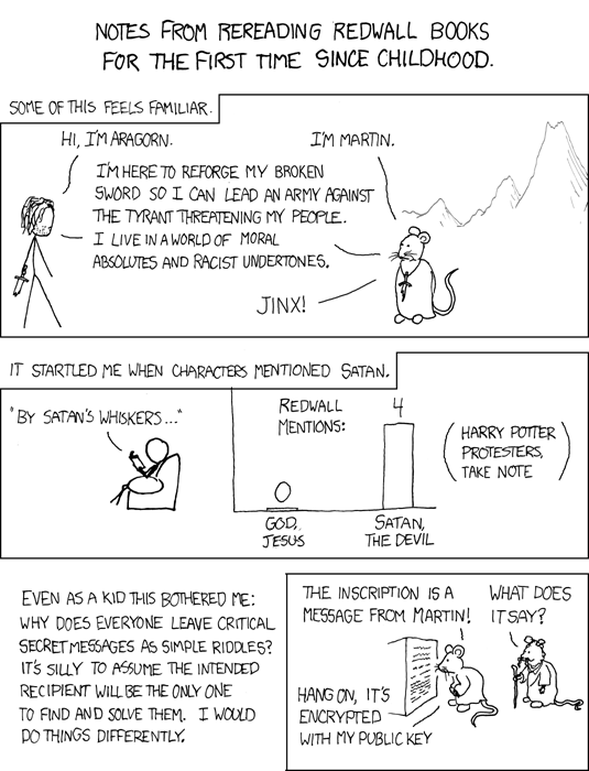
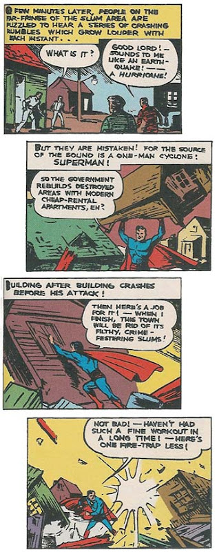
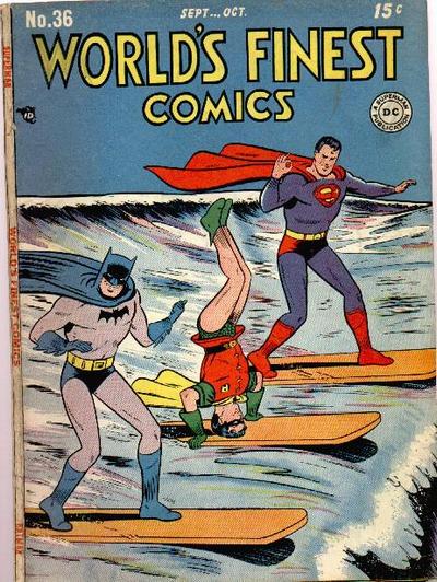
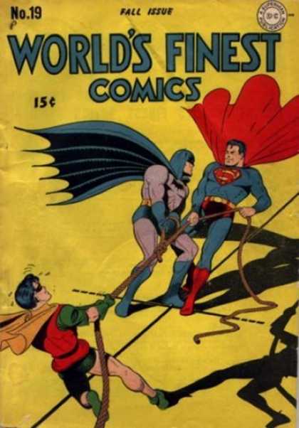
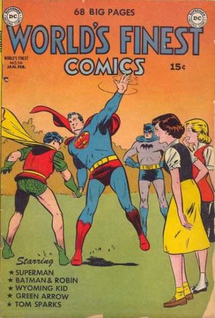
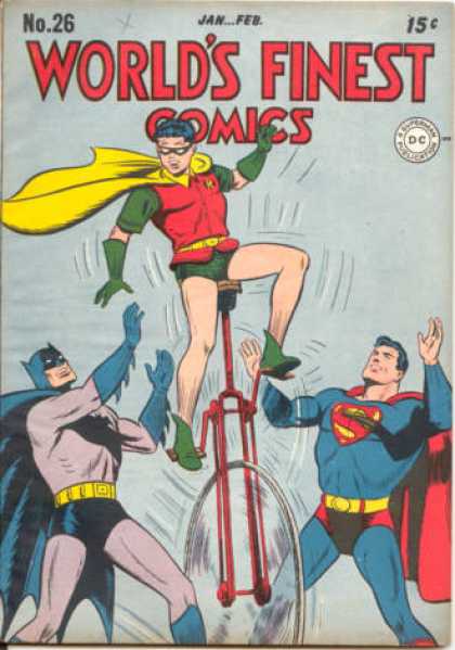
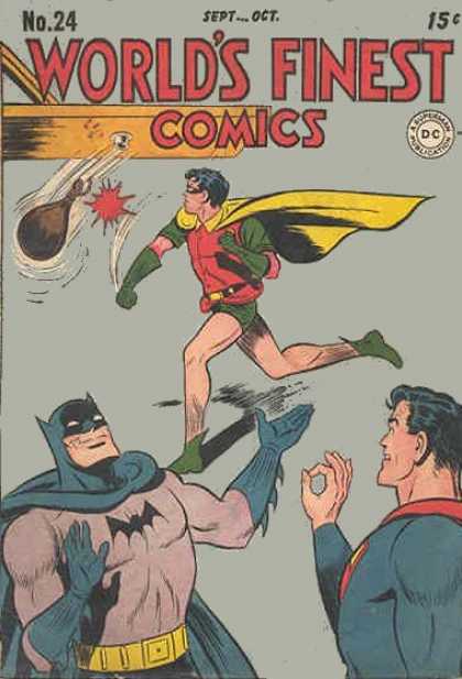
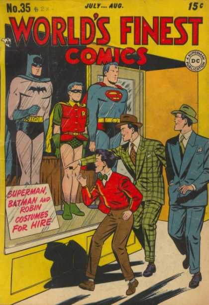
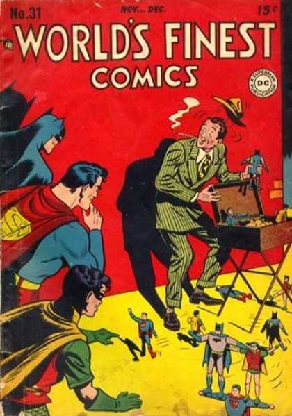
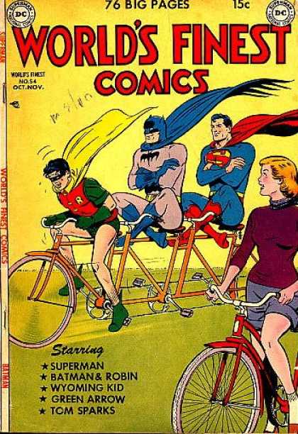
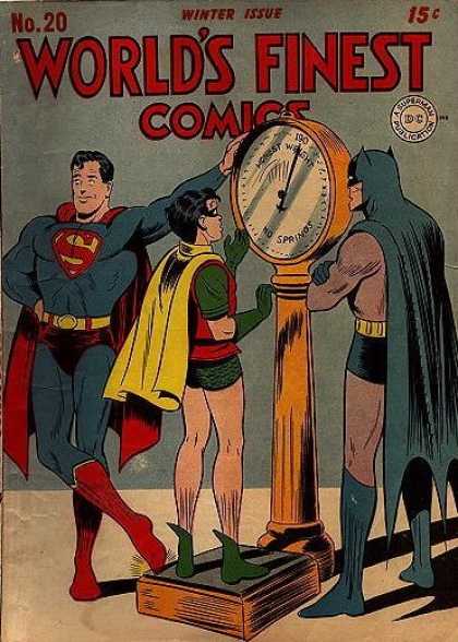
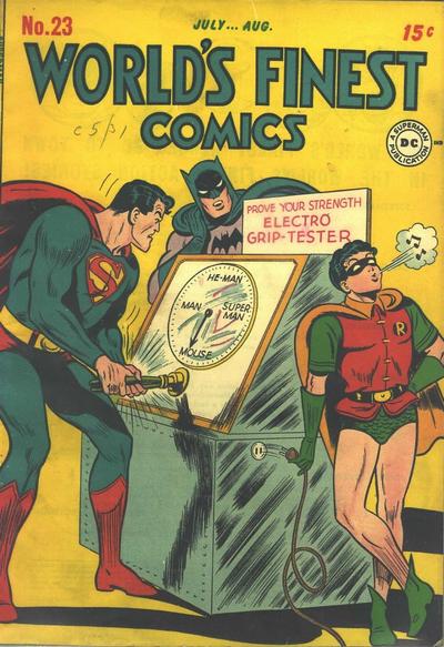
All Golden Age World's Finest covers can be visited through Cover Browser.