The Nesbit Model and the Baum Model
 For a while I've been mulling over two types of fantasy adventures that start in a world that readers recognize as much like their own. The difference involves the young protagonist(s). Does a group of children have the adventure together, or is a single child on his or her own? It's struck me that authors and series usually favor one form or the other.
The books with a group of children always have some boys and some girls, usually siblings but sometimes augmented with cousins and long-standing neighbors whose connection predates the book. I identify this grouping as constructed on the "Nesbit model," after the British novelist E. Nesbit, who nearly perfected the form more than a century ago in Five Children and It, The Enchanted Castle, and other delights.
Other fantasy books constructed along the Nesbit model include: These books have a sort of collective protagonist, with the siblings and friends bringing different strengths to the adventure and bucking each other up. That model has proved its value in non-fantasy series as well, such as Swallows and Amazons and its successors by Arthur Ransome; The Famous Five and its many, many clones by Enid Blyton; and Mystery Manor, by Mary Evelyn Atkinson, which I've never read, but which had such intriguing endpapers.
(I didn't include in that group books that have multiple protagonists, usually of both sexes, who are brought together by the adventure itself: Diane Duane's Wizards series, J. K. Rowling's Harry Potter books, Philip Pullman's His Dark Materials trilogy, and so on.)
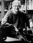
I identify the other set as following the "Baum model," though there might be precedents before L. Frank Baum's The Wonderful Wizard of Oz, such as Charles E. Carryl's Davy and the Goblin. In this set, a young protagonist travels alone into a fantasy world and attracts companions there, or deals alone with a magical element intruding into his or her world.
The protagonist in this sort of story is often an only child; it took 34 Oz books before any young protagonist had a sibling (in The Wonder City of Oz, shown at top), and four more before a brother and sister had an adventure together. If the protagonist in one of these book has a sibling or two, they're often obstacles to fun and adventure rather than companions.
Fantasies built along this model include:
Now perhaps I'm simply dividing books by one factor (quantity of protagonists), and deluding myself into perceiving that that classification leads to something of further significance. But I note that most of the authors in the first grouping are British, and most in the second are American.
Was that difference simply the result of Nesbit's and Baum's influences in their respective countries since the start of the 20th century? Or does it speak to a deeper significance about national cultures--America's cult of individualism, for instance?


 Yet I can't help but note that Superman tracked down the Ultra-Humanite through a racket called the "Cab Protection League." Was this ultra-genius really expecting to achieve "DOMINATION OF THE WORLD" by forcing one city's independent taxi owners into an association? I imagine him skulking in his lair, boasting to himself:

 The last few installments of my
  With
With 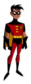


 My last
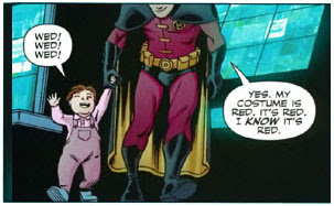
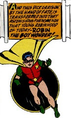
  Again, this costuming operated more on a symbolic level than as a reflection of life. The artists often used the same color contrast to distinguish Batman and Robin's civilian identities. The first decade of Batman comics would show Bruce Wayne in a blue suit or dressing-gown. Dick Grayson would wear the same eye-popping color combination during the daytime as at night. That meant readers rarely missed where Dick/Robin was in a scene.
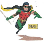 Adams's redesign, which DC eventually adopted, also emphasized various forms of protective fabrics, body armor, and built-in tools and electronics. The new, longer cape was said to be made of


 Captain America had no experience dealing with a cape, of course. If Chabon wanted a fair consideration of what "discerning superheroes" think of capes, he should have asked one who wears the garment what the essence of a hero's costume is.