31 May 2008

Near Earth

The Atlantic's June issue also contains an alarming story by Gregg Easterbrook on the threat of large asteroids and comets striking Earth in ways that could end human civilization or even the human species.

The most alarming part for me wasn't the science that suggests the probability of such an event is higher than people have thought, but the complacent comments from the Bush-Cheney administration's NASA head. He manages both to blame Congress for leaving "near-Earth objects" off NASA's priorities and to say that those priorities are exactly right, "the finest policy framework...in 40 years."

There are a couple of fantasy-literature connections in the article. I suspect that because an approaching space object was the premise of two "big summer blockbuster movies" a few years ago (Deep Impact and Armaggedon), lots of people have mentally filed this threat in the area of science fiction. The Atlantic and Easterbrook have their own, low-budget movie to watch on the web, which makes the same point.

The astronaut Rusty Schweikart, one of the most visionary people to have flown in space, leads the B612 Foundation with the goal "To significantly alter the orbit of an asteroid, in a controlled manner, by 2015." The article explains that deflecting an asteroid seems feasible with current technology (comets are another matter), and being ready to do so might be the difference between life as we know it and, well, not.

And the other children's literature connection? The name B612 alludes to the Little Prince's near-Earth asteroid, pictured in Antoine de Saint-Exupéry's book. (Image above from the fan site B612.net.)

30 May 2008

Sharing a Culture

The June issue of The Atlantic Monthly contains a thought-provoking article titled "In the Basement of the Ivory Tower" on the futility of pressing a university education on every American who hopes to advance in life, whatever their preparation or skills. The anonymous author, "Professor X," ends with finding the common element of American culture in--where else?--the MGM Wizard of Oz:

One of the things I try to do on the first night of English 102 is relate the literary techniques we will study to novels that the students have already read. I try to find books familiar to everyone. This has so far proven impossible. My students don’t read much, as a rule, and though I think of them monolithically, they don’t really share a culture. To Kill a Mockingbird? Nope. (And I thought everyone had read that!) Animal Farm? No. If they have read it, they don’t remember it. The Outsiders? The Chocolate War? No and no. Charlotte’s Web? You’d think so, but no.

So then I expand the exercise to general works of narrative art, meaning movies, but that doesn’t work much better. Oddly, there are no movies that they all have seen--well, except for one. They’ve all seen The Wizard of Oz. Some have caught it multiple times. So we work with the old warhorse of a quest narrative. The farmhands’ early conversation illustrates foreshadowing. The witch melts at the climax. Theme? Hands fly up. Everybody knows that one--perhaps all too well. Dorothy learns that she can do anything she puts her mind to and that all the tools she needs to succeed are already within her.
The sad irony, for Professor X, is that simply putting one's mind to a goal doesn't mean one has the tools to succeed. Of course, the literal message of the movie is also about staying home and not chasing one's dreams elsewhere (a message undercut by the rest of the movie, but that's another posting).

(Thanks to Chaucerian to alerting me to this article.)

29 May 2008

A Swipe at The New Yorker

Bookshelves of Doom pointed me to an item in the New York Post proposing, in its tabloidy way, that New Yorker cartoonist Harry Bliss had plagiarized an image for the magazine's Cartoon Caption Contest from the comic book great Jack Kirby.

The cartoon in question is for contest #145 on the magazine's webpage above. Kirby's cover for Tales to Astonish, #34, appears here, courtesy of the Grand Comics Database. Monster Blog offers a summary of the story, additional images, and readers' memories.

Bliss apparently felt that everyone would recognize the source of his picture, just as people would recognize Gilbert Stuart's George Washington or figures from Michelangelo's Sistine Chapel ceiling if they showed up in a New Yorker cartoon. He probably overestimated non-cartoonists' knowledge of this aspect of popular culture; some readers (and perhaps magazine editors) didn't recognize the image while others recognized it but felt the original was obscure enough to make this plagiarism rather than homage.

Part of the problem might be that a magazine cartoon and a comic-book cover are too close. Alluding visually to the Mona Lisa in a cartoon is a more obvious homage because that cartoon is not otherwise much like the Mona Lisa. But two magazine drawings?

Furthermore, Bliss's version isn't much different from Kirby's. He clearly observed the Tales to Astonish cover and thought, "Wouldn't it be funnier if the man in the apartment wasn't reacting to the MONSTER AT HIS WINDOW?" One can get halfway from the cover to the cartoon by simply emptying the man's word balloon. The rest of the way is just showing him speaking calmly on his telephone.

All that said, no other New Yorker caption contest in weeks produced an entry which made me laugh out loud. That caption:

"Okay, I'm at the window. To the right? My right or your right?"

Inspired by Julie at Children's Illustration, another possibility is:
"Yes, this is Harry. I should expect a representative from the Kirby estate to drop by?"

Over at Gawker, one commenter suggested:
"Oh, wait, my mistake--it's just an homage to a monster."

28 May 2008

Contains No Chemical Drugs

Yesterday, the New York Times reported on a new product for children: a cherry-flavored, chewable sugar pill being marketed by a mom-and-pop operation called the Placebo Store under the name Obecalp.

Some doctors are outspoken against this. They point out that while the placebo effect is well documented, it's effective when patients believes that a pill's not just a sugar pill. Thus, parents giving Obecalp to their children must be deceptive at some level, stating or implying that it's a chemically active medicine. Pediatricians also dislike promoting the notion that there's a pill for every ill instead of, say, a hug and an oatmeal cookie.

The Times article stated that one 2007 study of 70 children with ADHD suggested that acknowledging a pill contained no actual medicine but calling it a "dose extender" could be effective in weaning kids off their medications. It strikes me that study could just as well have showed that:

  • ADHD drugs might be overprescribed to begin with.
  • Children who have trouble paying attention are also likely not to pay attention to technical information.
  • Physicians conducting studies can come up with nice-sounding jargon like "dose extender" just as well as marketing professionals.
To be sure, there's a debate within medicine about how to handle placebos, and how strict the rules should be. At the base of that debate is a paradox. If a deception helps to make itself true, does it remain a deception? In other words, if a placebo has a chance of working when the patient believes in it, is it wrong to tell the patient that it has a chance of working?

When I looked into this story, I found that two years ago, in March 2006, there was a little spurt of television news about a Gulf War veteran named Mike Woods who recalled having been prescribed Obecalp. Here are reports from North Carolina and Washington.

Woods had actually testified in November 2005, according to this transcript of the hearing. And he described his experienced with Obecalp as having occurred long before that, at some unspecified time for some unspecified symptoms:
Years ago, I left the VA health care system, after being prescribed a powerful medication by the VA, "Obecalp"--a medication to be used with extreme caution. However, it does not work very well. Spelled backward, it is simply "Placebo."
This was part of the ongoing medical debate about "Gulf War syndrome," and whether that's a form of post-traumatic stress disorder and/or has a chemically detectable cause. The current war may have made the PTSD diagnosis more acceptable; it's certainly made it more widespread.

Back then, the idea that the Veterans Affairs medical system had deceived one man was enough to produce TV stories and angry blog postings. (Interestingly, I didn't find reports of any other veteran with the same complaint, nor any who said that sugar pills had helped them.) Now the target audience for Obecalp--a term that's apparently not trademarked--is children. I don't think this is progress. It just seems like a quest for the even more desperate (parents) and more credulous (kids).

Obecalp also prompted a dim memory of reading about a product advertised in the middle of the twentieth century whose name was also something good spelled backwards. It took a little Googling before I confirmed it was Serutan, a natural laxative. For more about Serutan's marketing profile, visit the Original Old-Time Radio. (Evian and Tums are two other brand names that are also words spelled backwards, but their makers don't actually encourage customers to do that.)

27 May 2008

What Did You Do in the Oz-Wonderland War, Grampa?

Earlier this month Bully at Comics Oughta Be Fun! offered a comprehensive (read: image-heavy) look at Oz comics, with particular attention to DC's 1986 miniseries Captain Carrot and His Amazing Zoo Crew! in The Oz-Wonderland War Trilogy.

That came out just after I stopped buying comics for a long time, so I obtained my copies a few years ago at an International Wizard of Oz Club convention.

Carol Lay's art is quite inventive: a melding of John R. Neill, John Tenniel, and the usual depiction of Captain Carrot and his team, who are cartoon animals that spoof superheroes and thus borrow a bit from both genres.

The plot involves--what else?--the Nome King's attempt to take over Oz. He's already turned most of the country's celebrities into ornaments for his palace. And not a chicken in sight. But Dorothy Gale, the denizens of Lewis Carroll's dreamlands, and Captain Carrot and His Zoo Crew still stand in his way.

You really do have to see it to understand the madness.

26 May 2008

Hailing Tom Wilkinson

In the last few months, all the best movies I've seen involved the British actor Tom Wilkinson. He played three quite different Americans:

  • the manic and doomed litigator Arthur Edens in Michael Clayton.
  • a canny, randy, and delicious Benjamin Franklin in the miniseries John Adams.
  • a smooth, brass-knuckled James A. Baker III in Recount, shown last night.
He was very impressive and entertaining in all three roles. I think Wilkinson's even pushed aside Jim Broadbent as my favorite British character actor right now.

Wilkinson won a BAFTA Award for Supporting Actor and international attention as the executive made redundant in The Full Monty. He's been nominated for an Oscar twice: for In the Bedroom and Michael Clayton. The first also won him a slew of critical awards, but it was a disturbing story with moderate box-office power, and thus not Best Lead Actor material for the Academy.

Wilkinson's been quoted as saying, "It's no good being great in something that goes straight to video." But two of the three roles listed at the top were HBO productions, and I'd be happy to see him in a lot more.

25 May 2008

Spoiler Alert for Robin

This past week turned out to be significant in Robin history. Robin, #174, confirmed what DC Comics magazines and editors had been hinting for months: that Stephanie Brown, the (by my count) fifth teenager to take the role of Robin, wasn't dead after all.

A little background. In 1992, shortly after Tim Drake debuted as the fourth Robin, the Batman comics introduced Spoiler: a female acrobatic masked vigilante in eggplant-colored tights and cape. Tim tracked down the Spoiler and identified her as Stephanie Brown, the teen-aged daughter of a minor villain named the Cluemaster. She was trying to fight crime--on a shoestring budget, with no mentor--out of embarrassment about her father.

The following year, DC launched the ongoing Robin comic book, and Tim's relationship with the slightly older Stephanie was a major plot engine over the next decade. As Chuck Dixon, the magazine's writer until 2002, said in a recent interview:

Frankly, Spoiler began as a pure plot device and evolved, because of fan interest, into a romantic foil for Robin. . . . It's also kind of cool that Robin has someone around his own age to run rooftops with. It's sort of a male fantasy to find a girl who shares your hobby.
Tim and Stephanie fell in love, had a baby (not his, but he helped at the birth), broke up, got back together, and went through other experiences of hormonal teenagers. On top of that, they had the typical experiences of comic-book heroes: finding out secret identities, switching bodies, having to fight their own parents, dealing with jealous ghosts, and so on.

In 2004, DC hired Bill Willingham to script the Robin series. I've mentioned Willingham's Fables comics favorably, and will have more to say about them in due course. Comic Book Resources interviewed Willingham about his eventful stretch of Robin comics:
CBR: While writing "Robin," the character has gone through some major changes, including his father finding out about his secret identity, the death of his father, the death of his girlfriend, and relocating to a new city. How many of these changes originated with you, and how many were given to you to explore by editors?

BW: What a nice way to put that - "...given to you to explore by editors" as opposed to, "inflicted on you against your will and better judgment," Well done. Very diplomatic. . . .

CBR: Despite all the changes the character has gone through, all of Robin's actions seemed true to his character.

BW: How nice of you to say, but some readers might disagree with that.
And so, it's apparent, might Willingham. The story of Tim Drake's father learning that he's been spending his nights as Robin, instead of, oh, playing in a midnight basketball league, appears in the collection Robin: Unmasked.

Tim's resignation for his dad's sake left Batman without a teen-aged partner. Meanwhile, the Batman editorial team had plans for a big "crossover" story to promote all their magazines, which would need some striking landmark event to drive the plot. These days, such comic-book events usually involve a character dying. Willingham had a bright idea, as he explained in that interview:
The death of Spoiler was locked in before I was asked to take over the series, but it was my idea to let her become Robin for a short time before that. My thinking is that it would be nice to give her at least one moment of glory, accomplishment and success, before all of those horrible things that were destined to happen to her.
Thus, Stephanie Brown became the first female Robin within the regular DC continuity. Most of the Batman stories in which she wears the red and green costume appear in a collection called Batman: War Drums. According to Willingham in an interview with Word Balloon quoted at evenrobins.net:
There was a nice spike in sales during that time and I wish her death hadn’t been so as locked in because when it started going really well, what I would have liked to have said was, "Let’s follow this for a while." That was not available as an option and you can’t really...do that same stunt over and over again. We had that momentum once, we lost it.
The long-planned crossover is archived in the three Batman: War Games volumes; many fans seem to feel that's three too many. Having been fired as Robin, Stephanie returns to her Spoiler role and ignites a gang war. A villain named Black Mask captures and tortures her. Tim Drake returns as Robin, sadder and madder. Batman beats up people. And, we are given to understand, Stephanie Brown dies for our entertainment.

Here's a passage from yet another interview with Willingham, from the AV Club, on his great notion:
My personal theory is that we've all got this bucket full of good ideas, and if you just hold onto them, your bucket never gets fuller. There's only so many you can hold at a time, but as fast as you use them up, it fills up again with more good ideas. My notion is to spend everything you've got coming through your head as fast as you can, and you're guaranteed to get more good stuff.

So while writing Robin and stuff like that, if I had good ideas, I'd try to pitch them and run with them. Sometimes it backfired. It was my idea to make Spoiler into Robin, just before she died horribly. I thought that would be a good thing for the character, but it turns out that legions of female fans now detest me for doing that.
Indeed, they did. Which seems unfair because DC's (outgoing) editorial powers had decided on the death of Stephanie Brown before Willingham took the job.

Critics saw Stephanie's violent death as fitting into a larger pattern of how comic books exploit supporting female characters to provide angst for leading male characters. Ten years ago the website Women in Refrigerators catalogued many other examples of female characters and their suffering. This list is not unlike the one about gay superheroes killed in mainstream comics that novelist Perry Moore assembled. I'd like to see a comparative analysis of straight male secondary characters and their fates as well; those guys may also be plot fodder.

Since DC killed and resurrected Superman in the early 1990s, death and rebirth have been superhero clichés. When a company could thrive while (temporarily) killing off even its oldest, strongest, and most lucrative trademark, a supporting character like Spoiler doesn't stand a chance of avoiding the grim reaper. But any comic-book death, unless it defines a hero's origin (as in the killing of Bruce Wayne or Dick Grayson's parents, Peter Parker's uncle, or the entire planet of Krypton), can be reversed when the market seems right.

Gail Simone, the creator of Women in Refrigerators, had a simpler argument for the superhero comics publishers: How will you attract female readers and stay in business if you keep killing off or hurting your female characters? Her criticism brought her to the attention of DC Comics, which hired her to script Birds of Prey, about an all-female superhero team (which had at times included Spoiler as a trainee), and now Wonder Woman.

The elimination of Stephanie Brown inspired more specific protest, such as this open letter from Katherine Keller and other internet essays. Fan anger focused around Project Girl Wonder, an email crusade to have the Batcave include a memorial for Stephanie, just as there was one for the third Robin, Jason Todd. (He's come back from the dead, too, a couple of years ago.)

As the clues piled up this spring that Stephanie would be brought back alive, the Girl-Wonder.org website suspended its campaign. Project Girl Wonder had probably played a role in the character's return--not by putting pressure on DC Comics in a political sense, but by showing that Spoiler had her own fervent fan base. [Girl-Wonder.org remains active as a source of commentary on the bigger, ongoing issue of females in superhero comics.]

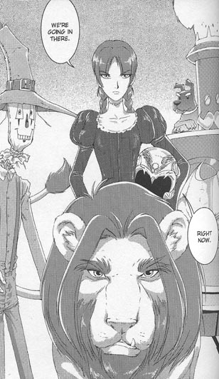
Now Stephanie's back. And as you can see in this image from the latest Robin, drawn by Chris Batista and Cam Smith, Tim's very pleased to see her. (Yes, he does have a bo staff on his belt, but he really is pleased to see her.) One question now is whether Stephanie Brown was popular because she was unfairly treated and cruelly killed off, or because of some internal appeal of her personality that can keep her around.

Next month brings a one-off Robin/Spoiler magazine. The cover by Rafael Albuquerque (at top) pays tribute to Carmine Infantino's iconic image from the late 1960s of Batman and Robin on a rooftop. Visit the ad-heavy Bat-Blog to see the original and some previous homages.

24 May 2008

Curious Indeed

Several genres of short, full-color, hardcover books mimic picture books for kids, and are even marketed as such, but really aren't. Among them are parodies, those I-love-you-more books for new mothers, many celebrity picture books, and graduation gifts.

And among this season's graduation gifts, I noticed during Karen Day's No Cream Puffs signing last week, is Curious You: On Your Way! To create this title, Houghton Mifflin commissioned a non-narrative text from Kathleen W. Zoehfeld (not that you'd know her name from the cover or catalog), and then digitally pasted those words over the illustrations from Curious George Takes a Job (and perhaps some other Curious George books by H. A. and Margret Rey).

As a Curious George fan from way back, I think I'd have been charmed to receive a crisp new copy of Curious George Takes a Job when I left college. I'd have been less than pleased by this volume. Most "gift books" feel like they've been designed for people who aren't comfortable with real books, and are really looking for a greeting card with a $16 price on it.

23 May 2008

Why Does the Cows’ Laptop Click, Daddy?

I'm grateful that Gail Gauthier pointed me to this Slate slide show assembled and annotated by Erica S. Perl of recent picture books (plus Richard Scarry) and how they reflect modern technology--or often don't.

Why do the cows in Click, Clack, Moo practice Typewriter Realism for readers who may never have seen a typewriter, especially one that doesn't have to be plugged in? Does that actually reflect the typewriter nostalgia of grown-up picture-book creators and buyers?

As for cell phones versus land lines (which is what we used to call "phones"), I have a picture-book manuscript whose plot depends on a character tripping over the cord that connects a phone to a handset. If I sell that, I'm not sure any of the target audience will have seen such a phone cord. Unfortunately, I've said that for years, and have come no closer to polishing the dummy for submission.

Back to the slide show: I especially admire the The Sure Thing reference.

22 May 2008

Tin Men on Parade

These "Tin Men" were created by members of the Sheet Metal Workers International Association, local 17 in Boston (photograph by Jason Dowdle). They're part of an exhibit called "Keepers of Tradition: Art and Folk Heritage in Massachusetts" sponsored by the Massachusetts Cultural Council and now on display at the National Heritage Museum in Lexington, Massachusetts.


And here's a more journalistic photograph of sheet metal workers as "tin men" in Boston's Saint Patrick's Day parade, recruiting new members.

21 May 2008

“New England Voices” for 2008

Last night I had a fine time moderating the Foundation for Children's Books' "New England Voices" event at Boston College.

I introduced Barbara O'Connor by talking about the sense of place in her novels, including her most recent, Greetings from Nowhere. And then I put the Great Smoky Mountains one state too far north. So this morning I'll just let the atmospheric book trailer make that point for me.

When Barbara and I were talking afterwards, I realized that we first met all the way back while she was working on her first novel and I still had a regular job!

Susan E. Goodman then shared the story behind her new book about the US presidential election process, See How They Run. I think it's fair to say that you've succeeded at keeping your own political views out of a book for kids when the first angry email you get accuses you of having a bias against a president you actually voted for.

Susan invites all kids in grade 2 through 8 to participate in her Kids Speak Out! survey.

Lita Judge told the extraordinary story of a post-WW2 relief effort that her ornithologist grandparents spearheaded, with Americans sending shoes, clothing, soap, and other supplies to families in Germany and other parts of devastated Europe. Among the families they helped, it turns out, was that of famed naturalist Bernd Heinrich.

Combining items from her family's archives (which is a fancy word for the fact that her grandparents never threw anything out), period artifacts, and her watercolors, Lita told her mother's side of this story in One Thousand Tracings (also available through the Friends General Conference). Lita and her friendly husband/tech support Dave have created a rich website to share the stories and images that couldn't fit into the book.

20 May 2008

Punctuation as a Moral Issue

I put so much attention toward details of punctuation over the past week or so because of the feeling expressed in my tag for this topic. For a lot of editors...

Punctuation is a moral issue.
Not such a compelling moral issue as plagiarism or fraud or cruelty, of course. In fact, punctuation and related writing details probably shouldn't be moral matters at all.

But as an editor, you spend so much time working on the details of a book that when you see a manuscript that gets the basics wrong, it bothers you at a deep level. The fact that its problems are a relatively easy fix just makes the error seem worse. You don't want to make judgments based on these things, but they just don't sit right with you. They're wrong.

I'm not talking about such subtleties as when to capitalize after a colon according to the latest Chicago Manual of Style, or whether a newspaper journalist should use the serial comma when writing a book. I'm talking about basic things like putting single-quote marks around a quote within a quote, and not trying to make "however" into a pure conjunction (e.g., "We had recess, however it was raining").

Perhaps some editors look at such details in a manuscript and think, "A chance to be useful!" But I bet most at some level are stewing: "How can someone who wants to be a professional writer care so little about proper writing? It's not that hard to learn the difference between it's and its! Haven't you read enough books to know that the essay at the start is a foreword, not a 'forward'? Why can't you see that that's wrong?"

And that attitude not restricted to publishing. I suspect people in every profession are prey to similar feelings about their beloved customers. My automobile mechanics were probably shaken to their core by how haphazardly I maintained my car, even though that meant more work for them. Piano technicians can be baffled and even offended by the ways that piano-owners treat their instruments. Web designers think about the ethics of target="_blank" links. Dentists care deeply about other people's mouths, which are both their business and none of their business.

And by and large that's a Good Thing. We want professionals to care deeply about the quality of their work and its outcomes. We want them to believe in the value of their efforts and wish the best for us, despite our repeated failures to measure up. If editors didn't feel that proper punctuation and grammar and exciting storytelling and clear writing were noble causes, then books would be far, far worse (because their salaries sure aren't big enough to motivate them).

Of course, most editors tamp down these feelings when it's time for lunch with their authors. Punctuation is, after all, an easy fix. But the inescapable conviction that punctuation (and other technical aspects of writing) is a moral issue can come up when editors are reviewing manuscripts, even if they don't want it to.

If a book is totally brilliant and/or highly commercial, an editor will chase after it even if the manuscript is written with no punctuation on paper towel with a lipstick. But most projects aren't at that level. They're in a gray area, and the gray gets darker if an author or subject doesn't have a good sales record. All the more reason for aspiring authors to learn the rules and do an extra round of proofreading.

(Punctuation art from Esther Raizen and Jane Lippmann at the University of Texas at Austin.)

19 May 2008

Seeking an Irony Font

Last November, MotherReader wrote: "I’d pledge my lifelong allegiance to the person who comes up with an ironic font--and no, the little winking emoticon isn’t enough." And that offers a fine topic to revisit as PUNCTUATION WEEK at Oz and End rolls on.

There are some other symbols beside ;-) to consider. According to Wikipedia, the Ethiopic languages already have a sarcasm mark. It looks like an upside-down exclamation point:¡ This mark is already programmed into many Western keyboards because it's used at the start of exclamatory sentences in Spanish. I rather like the idea of borrowing from Ethiopian culture, given its age.

The French poets Alcanter de Brahm and Hervé Basin proposed a punctuation mark for irony, as well as signals for doubt, certitude, indignation, and other emotional states. Most look like they'd belong in Dr. Seuss's On Beyond Zebra, but the irony sign is basically a backwards question mark. Alas, it was used in the Middle Ages for rhetorical questions, so in any exchange of letters with medieval monks it would simply cause confusion¡

Finally, as I wrote last fall, there’s the solution William Thornton proposed in 1793, of putting a plus sign on either side of an ironic statement or phrase. Supposedly, that's been adopted by Collegehumor.com since they're such big fans of eighteenth-century semiotics¡

But none of those symbols are fonts. By "font," I presume MotherReader meant a standardized variation within a typeface--a variation that can applied to any face. (As opposed to the recent use of "font" to mean a specific typeface with all its variations, such as Helvetica.)

Standard digital typography offers a plethora of ways to emphasize words.

We have italics, underlining left over from typewriters, boldface, ALL CAPITAL LETTERS, and even various colors.
So theoretically we could take one of those styles and decree that henceforth it signals irony rather than emphasis. (I've already called for a halt to underlining for emphasis.) But using one of these formats would confuse some people. We need a style readers haven't seen before.

I propose that the best option would be backslant. Few typefaces have this style, but it would be relatively easy to create: it's basically the opposite of italics. And the fact that it makes letters lean in an unexpected way would help to convey a writer's ironic/sarcastic tone.
(Backslant examples use variations of the Roemisch Rueckwaerts Liegend typeface.)

18 May 2008

Good Punctuation Is Essential, Robin.

Some Oz and Readers might have assumed (or hoped) that PUNCTUATION WEEK would mean skipping a weekly Robin installment. But comics have punctuation, too.

In fact, popular American comics have developed their own system of punctuation and typography, related to but not conforming to the standards for prose. Worries about capitalization go away when most sentences are rendered ALL IN CAPITAL LETTERS.

Comics punctuation allows writers and letterers to do some things that standard prose styles don't allow. Using boldface for emphasis, for example. Larger letters for more emphasis. Boldface and larger letters for even more emphasis!

The shapes, sizes, and layouts of speech balloons function as a form punctuation--that topic could be a posting in itself. In fact, earlier this month I discussed how David Hutchison came to use balloon shapes and fonts to distinguish his characters in Oz: The Manga. So today I'll just mention a few miscellaneous quirks of comics punctuation.

The panel on the right shows a rather unusual use of punctuation in a superhero comic dating from the "Golden Age" or early "Silver Age." Indeed, that usage probably shows up in this panel only because it was created in 1943, when the standard style was still being developed. Can you spot the detail?

It's a period. The first two sentences of the surgeon's speech end with periods. By the late 1940s, as far as I can tell, that punctuation had all but disappeared from DC Comics.

Instead, most remarks in speech balloons became exclamations! Everything was dramatic! Even the most mundane remarks!

And if a speech really didn't call for an exclamation point or question mark...then it ended with an ellipsis--or two hyphens... (Or three hyphens, or one, or four dots--all shown in these 1940s panels.)

One sign that American comic books were maturing in the 1980s was that they welcomed back periods.

And what about those two hyphens? It's almost impossible to find an em dash in superhero comics of the 1950s and '60s. But those comics were usually hand-lettered (mechanical type was cheaper, but awkward and less expressive). Letterers could easily have drawn a long dash; they weren't bound by typewriter conventions. But two hyphens must have appeared on the typewritten scripts, and thus two hyphens went into the speech balloons.

As time passed, the two-hyphen style became the comics standard. According to the Dark Horse Comics style sheet printed in Peter David's Writing for Comics, double dashes have multiple uses but "long dashes and semi-colons are not used in comics punctuation. Colons are used only on rare occasions." How long will that last?

On the left, Nightwing demonstrates another form of punctuation found in comics of all kinds (not just superhero adventures): the combination of question mark and exclamation point.

The two punctuation marks almost always appear in that order, though I've seen such variations as ?!? and ?!?!?!

This punctuation usually signals a combination of puzzlement and alarm. In prose, it's possible to convey those emotions through words outside the dialogue:

  • "Who?" Dick yelled.
  • "Who?" Dick asked loudly.
  • "Who?" Dick said with a combination of puzzlement and alarm.
But comics don't have those options; they have to convey how characters speak graphically. Hence the double punctuation.

Another combination of question mark and exclamation point is the interrobang. As World Wide Words relates, the advertising executive Martin Spekter invented this mark in 1962. He wanted it to signal a rhetorical question: "Have you ever seen such bargains" Enough type designers have liked the idea (or, more probably, the name "interrobang") that Unicode reserves space for this mark and its Spanish inverse.

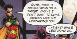
Nevertheless, neither the interrobang nor the juxtaposition of question mark and exclamation point fits in standard prose. They belong only in the most informal or experimental writing. To include them in a book manuscript is to risk being perceived as someone who hasn't read enough books to pick up the rules.

(All that said, the interrobang is on my short list of non-standard punctuation most likely to become standard in the next few decades, if people ever agree on what it signals.)

Finally, comics creators are now in a transition from lettering by hand to inserting digital text into digital art files. The hand-lettered aesthetic is still dominant, so even people who letter on computers use fonts that look like handwriting. (John Norton and Kevin Cannon offer tips on creating a font that looks like your handwriting.) Scott McCloud uses a font based on his writing in his comics, for example, while Eric Shanower still letters by hand--at least as of a year ago.

Given that trend, I suspect we'll see more of the symbol that appears in the following image from the recent Robin collection Days of Fire and Madness. You see the little box after the first period? It's not really punctuation. Rather, the text included a character which that font could not render, so the computer substituted a "missing character" glyph. And no editor caught it, either in the original magazine or this collected edition.

17 May 2008

Dot Dot Dot

You folks have probably figured out that PUNCTUATION WEEK at Oz and Ends is really an excuse for me to grouse about the deficiencies of my word-processing program or common glitches I see in manuscripts. But why stop now? Today I address the burning question of ellipses!

When a character is interrupted or breaks off suddenly, that character's dialog should end with an em dash (or its equivalent), as in the alleged last words of Union general John Sedgwick:

"They couldn't hit an elephant at this dist--"
(I'm annoyed to see that, according to Wikipedia, Sedgwick got that whole sentence off--twice!--and only then was felled by a Confederate sharpshooter. The dialog is much more dramatic with the interruption, isn't it?)

On the other hand, when a character's speech trails off into silence, or the narrator doesn't care to pay attention any more, a writer should use an ellipsis, which is Greek for "three little dots."
"No, Mommy, we're not sleepy at..."

"And so, as I wrote on this next slide, the incremental increase in the past fiscal quarter is greater than the corresponding quarter of last year, but smaller than the intervening..."
Every so often I see a new writer tempted to stretch out an ellipsis into four or five periods, apparently to indicate more time passing. That's not standard yet, which means that it's wrong.

Scholarly writing makes a useful distinction between two types of ellipses. That style uses the traditional three periods (or, in proportional typefaces, one ellipsis mark) when a quotation is missing a phrase from within a sentence.

And there's what I'll call (in allusion to James Thomson's "Seasons") a "long ellipsis": three periods with spaces in between them to indicate when a sentence or more has been removed.

I'll take an example from Boston 1775, a quotation from Prof. David Blight, Director of Yale's Gilder Lehrman Center for the Study of Slavery, Resistance and Abolition, on the recent legend of a "quilt code" on the Underground Railroad:
The reason your student is not finding primary material on quilting in the Underground Railroad is because in all likelihood there isn’t any. This is “myth” of the softest kind that serves the needs of the present for people who prefer their history as lore and little else. . . .

The quilt story...will survive and thrive as long as it serves real needs in the desires many people have from history--to convert tragedy into something triumphal, suffering into progress, complexity into curiosity, nitty gritty social and political history into material culture we can touch and see.
The first, long ellipsis represents the removal of more than a sentence. (Since it follows a period, the result is four spaced-out dots. But that's the maximum number of dots a writer can pile up.) The second, short ellipsis in the second paragraph occurs within a single sentence.

Tendentious scholarly writing, defined by a previous version of the MLA Style, requires that ellipses added by the writer be signaled with brackets: [...]. Most fields outside literature don't deal with texts that already have their own ellipses, so readers in other disciplines can basically assume that all ellipses have been added by the present writer.

Once again, I suspect, British typesetting is different from American. Some styles dictate a space on either side of an ellipsis mark, and no distinction between the long and short forms.

16 May 2008

Title Case: Another Reason the Makers of MS Word Will Be Damned for Eternity

Yesterday I discussed how the “smart quotes” function of Microsoft Word isn't quite as smart as it's made out to be. Which is to say, relying on it will, under particular circumstances, produce the wrong results for a writer. But at least that function tries to approximate the proper use of quotation marks and apostrophes.

"Title Case" doesn't even try. This command is found under "Format" and "Change Case...," at least in my version of MS Word. It will reformat the text you've highlighted so that each word starts with a capital letter and the rest of the letters are in lowercase.

The name "Title Case" implies this is how titles should be formatted. That Is An Error Which A Smart Writer Or Typesetter Tries To Avoid.

There are rules about which words to capitalize in a title. Unfortunately, there are multiple sets of rules, not all agreeing exactly. And the style for newspaper headlines is, once again, slightly different from the style used in book publishing.

Nevertheless, there are rules, which means that MS Word's programmers could have written algorithms to make "Title Case" accurate, or at least more so. Allen Wyatt's Word Tips provides the recipe for a macro that people can apply, but have to complete on their own. Ardamis.com has provided something even better, but only for WordPress blogs.

The Microsoft programmers could also have chosen another name for that function, like "Initial Caps." But no. So now, because of the company's dominant market share, we have lots of people, especially businesspeople, believing their computers are right to Capitalize Every Word In A Title Or Heading.

Grumble, grumble, grumble.

15 May 2008

Would You Like Curly Quotes with That?

Here's another punctuation peeve for PUNCTUATION WEEK, with more blame for the lowly typewriter. (Mind you, the typewriter was a great improvement over the scrivener as a way of producing legible documents, but I want to be clear about all that our everyday written language gave up for it.)

As part of the Great Typewriter Squeeze, minimizing the number of keys on a typewriter keyboard, manufacturers replaced the traditional open- and close-quotation marks with a symmetric up-and-down ditto mark. "It works both ways!" they told customers. "People will barely notice the difference."

For the same reason, the typewriter's apostrophe was symmetric and stood in for the open-single-quotation mark. (Some folks might even recall creating an exclamation point out of an apostrophe and a period; some typewriters saved another key that way.)

Years ago, I was delighted to find that Microsoft Word and other WYSIWYG word-processing programs offered the option of "curly quotes"--automatic conversion of typewriter apostrophes and quotation marks into the typographical open- and close- forms. This feature also got the name of "smart quotes" because it made both the computer and the writer look smarter.

But not everyone turns on "smart quotes," or knows how to use a global search-and-replace to achieve the same result. For a while, it was easy to spot self-published books by their non-curly quote marks. This wasn't as annoying as what the "Blog" of "Unnecessary" Quotation Marks documents, but non-curly quotes do make the world a little less pretty.

Unfortunately, there are still a few bugs in the "smart quotes" system. The algorithms that word-processing programs use for choosing how to make a quote mark curl have problems with certain sentence forms.

  • ’Tis a great bother when a sentence starts with an apostrophe. MS Word wants to make anything that looks like a quote mark with a space, tab, or pilcrow in front of it into some kind of open-quote mark.
  • “Or when a piece of dialog breaks off sudd--” That sentence should end with a close-quote mark, and my current program keeps making it an open-quote. Em dashes and quote marks have trouble in other situations as well.
  • The symbols for inches and feet actually should look like the typewriter's symmetric quote mark and apostrophe, and not curl. Not a big problem for me, but I figure I should acknowledge it.
Finally, because Microsoft doesn't work or play well with others, different word-processing programs, email programs, and browsers handle curly quotes differently. For a while, transferring text from one format to another could make curly quotes disappear, turn into other characters, or turn into code. Unicode is helping to fix that, but Microsoft had to come around to a standard it didn't control.

Will we one day have true “smart quotes” that don't require us to correct what the algorithm gets wrong? I live in hope.

(Folks might notice that, for all my soap-box speechifying about curly quotes and em dashes, I don't usually use them on Oz and Ends. That's because I'm practicing what I've called "Typewriter Realism," creating the illusion of a traditional manuscript using the font and typography of an old-fashioned typewriter. Whether that's a good idea is another question. I've landed on a different style for Boston 1775, with careful attention to curly quotes, most of them hand-typed because there's no “smart quotes” feature for Blogger.)

14 May 2008

Dash It All!

More grumbly bits for PUNCTUATION WEEK! English language typography once had a full quiver of dashes in different lengths. These were useful when eighteenth- and nineteenth-century writers wished to keep their references anonymous: “In the small village of P——————,” for example.

For journalists, that approach conferred plausible deniability: “You think ‘the corrupt G————— B—————’ refers to ‘Governor Bernard’? No, I’d never thought of that. I was writing about my, um, cousin, George, um, Barleycorn. Now there’s a corrupt fellow.”

Gradually those dashes boiled down to three main types:

hyphen -
en dash

em dash

The last two got their names because they're the width of the font's lowercase n and capital M, respectively. (There are still standard uses for two-em and three-em dashes, but they're specialized. Also, according to some standards the en dash should be half the width of the em dash, whatever the font's n looks like.)

Then, about a century ago, came the Great Typewriter Squeeze. As I mentioned yesterday, typewriters offered a limited number of symbols, and required them to all be the same width. Those machines made no distinction between hyphen and en dash, so people basically forgot it (not that many people probably knew it to begin with).

Since a lowercase n and a capital M were the same width, typewriters didn't offer an em dash at all. That punctuation mark is so useful, however, that typists came up with ways to approximate it. The most common were--a double hyphen -- a double hyphen with a space on each side - and a single hyphen with space on each side. Millions of people learned one of those forms in typing class.

Now, with laser and inkjet printers setting type in proportional fonts, we can go back to using em dashes as they were meant to be used--but people are still typing double hyphens. And not just in fonts like this one, designed to replicate the typewriter look.

I still see double hyphens used in proportionally spaced fonts. As a result, dashes--which can be a most elegant form of punctuation--don’t get to spread out as they should. And the result looks unlike a book, and unprofessional.

Of course, in their never-ending quest to make life easier for us, whether we want it or not, many word-processing programs will now automatically convert double-hyphens to em dashes. People still struggle over whether to put spaces before or after those punctuation marks. The standard answer, according to American and traditional British typesetting style, is that there should be no spaces around an em dash.

However, some confusion can easily arise because modern British typesetting style is different. As part of what I've called “The Great British Punctuation Shortage”, many modern British books use an en dash with a space on either side where in America we use an em dash with no spaces. That opens the door to using spaces around en dashes or em dashes if it looks good on a document--as long as one sticks with that style symmetrically and consistently.

And for the cherry atop this sticky sundae of confusion, I'll note that the proofreading symbol that means “insert an em dash here” looks like one wishes to shove in an algebraic value, “one over M.” Check out EEI Communications' proofreading page to see it in action.

13 May 2008

Stop Underlining, People!

PUNCTUATION WEEK continues with some good old-fashioned grousing! The English language had a fine system of punctuation and typography until the typewriter came along. (Illustrated history of early models here.)

While that machine made it possible for every office and eventually every household to produce legible, standardized text, it also came with some technical limits. The typewriter keyboard offered writers a smaller set of symbols to choose from. The machine required each character to be exactly the same width. And between those two limitations, our notions of punctuation became sadly impoverished.

Over the last twenty years, laser and inkjet printers have made it possible to approximate the typesetting we see in books. But most people are still typing in ways they learned back in high-school typing classes, and I think the results are ugly.

One example is how typography uses italic type to emphasize a word or indicate the title of a book or similar long artistic work. (Titles of short works, such as songs and short stories, should appear in quotation marks.)

Typewriters couldn’t provide italic characters, so early on their manufacturers came up with an alternative. The standard instruction to typesetters to italicize a word in a handwritten manuscript or a proof was to draw a line underneath it.* By backing up and using the underline key, typists could put lines under their letters. So the style manuals declared that underlining was the typewriter equivalent of italics.

But we don't need underlining anymore, at least not for this use. It looks ugly; that's why we rarely see it in books. And a manuscript that contains both italics and underlining just seems confused. Let's make the shift to italics once and for all!


* Similar proofreading instructions:

  • Two lines underneath = put this text in small-caps style.
  • Three lines = capitalize.
  • A squiggly line = boldface.
  • A dotted line = forget what I scribbled and leave the text the way it is.
More to see here.

12 May 2008

Underused Punctuation Terms

I've decided to make the next several days PUNCTUATION WEEK at Oz and Ends. Or perhaps I should say it will be a PUNCTUATION PERIOD. Ahem. I'll start with remarks on little known formal names for some punctuation marks.

pilcrow: 
For more on this little-known word, see Michael Quinion's World Wide Words article. That's where I first learned the formal name for what I'd thought of only as the "paragraph mark." It was once common as a sort of bullet point and in legal codes, but is now visible mostly to writers using word-processing programs.

virgule: /
Usually called the "slash" these days, though less common synonyms include "separatrix" and "stroke." It's similar to but not the same as the solidus, which is the diagonal line in a fraction. A virgule is closer to the vertical than a solidus, but usually one has to see them side by side in the same typeface to know the difference. On a typewriter, of course, they're the same (and I'll have much more to say about the typewriter's effect on punctuation this week).

guillemets: « »
These are the equivalent of quotation marks (a/k/a "inverted commas") in several languages, including French, Russian, Norwegian, and Persian. They're also the equivalent of quotation marks in several other languages, such as Danish and Czech, but in those cases they point the other way (at the quoted works rather than away from them). Swiss German follows the first convention; German and Austrian German the second. Finally, Finnish and Swedish surround quotations with two guillemets that both point to the right. Chinese typographers have adopted pointing-out guillemets to denote the title of a book. Robert Bringhurst's The Elements of Typographic Style says the word "guillemet" honors the the sixteenth-century typecutter Guillaume le Bé.

octothorpe: #
This is the most recent, and thus seemingly most artificial, of these punctual terms. Once again, Quinion's World Wide Words explains the history: "octothorpe" was Bell Labs jargon for one of those two function keys on touch-tone telephones that got labeled with symbols instead of numbers.

The tic-tac-toe symbol itself had been around long before, of course, usually called the "number sign" or the "pound sign" for what it symbolized. In much of the world, of course, the sign for a pound is £, and it's valuable to keep track of that sort of pound. And the symbol had other names--which is why Bell Labs wanted an official label.

Notwithstanding that effort, American telephone companies now refer to that symbol as "the pound sign," usually in a cheerful mechanical voice. British Telecom prefers "square," a coinage that dates all the way back to 1989. Other English-speaking countries call that button the "hash key," using an older term for the symbol apparently shortened from "crosshatch."

"Number sign" prevails in America when the same symbol is used to designate a number in a series. And the sign is often used to mean a "sharp" in musical notation, though typographically that should look different.

Most paradoxically, in proofreading, a # is the symbol for nothing, indicating that the typesetter should insert a space between two characters. Out of habit I use that symbol when I critique manuscripts, and usually forget to explain what it means. Some of my writing-group partners are no doubt baffled by my apparent love for the octothorpe.

11 May 2008

Dick Grayson Goes Off to College

Back when I started this weekly Robin series, I described how the first superhero comics collection I ever read was Batman: From the '30s to the '70s. The last story in that volume to feature Robin was "One Bullet Too Many" from Batman, #217 (published in 1969), scripted by Frank Robbins and drawn by Irv Novick and Dick Giordano. This story begins with Dick Grayson leaving stately Wayne Manor as he heads off to college.

Dick's departure was part of a revitalizing change in the Batman comics. In the same story, Bruce Wayne closed the Batcave, moved to an apartment in Gotham City, and dedicated himself to the charitable Wayne Foundation. That issue emphasized forensic investigation rather than the semi-comic capers and sci-fi of the previous decade. The look of all Batman stories grew more realistic (though the next few years contained more than enough horror stories).

As a young reader, I thought "One Bullet Too Many" was the last Batman and Robin comic-book story ever, that the From the '30s to the '70s collection covered the complete arc of their partnership. As a more sophisticated re-reader last year, I noted that the editors had actually included a later story featuring Robin, but fooled me by printing it earlier in the book. Throughout the 1970s, the writers brought Dick back from college whenever Batman needed a Robin.

I recall that comics volume coming from the library of the college where my father taught. He was a professor, as were all my uncles on both sides. Given that heritage, I never had any doubt that I'd go to college myself.

For that reason, no doubt, Dick Grayson's departure for college stuck with me more than the rest of this tale. It was the first fictional depiction I ever saw of that rite of passage. Indeed, I'm hard-pressed to think of another. The closest I can recall are moments in Breaking Away and Roots: The Next Generation, meant for general audiences rather than young readers.

Most YA fiction treats high school as the most important time in anyone's life--ever. There's a raft of fiction about young people in college, usually written by and for folks just out of it. But this comic book offered young readers the scene of a college-bound teenager taking leave of his family (even if that family consists of a slightly older man who dresses as a bat and a faithful English retainer). Can anyone offer other examples of such a scene from children's literature?


That comics page had been stuck in my mind for over ten years when I went off to college myself. Traveling with my family and a Datsun crammed with stuff, I had the vague sense that I was doing it wrong. Now I know why: my journey wasn't anything like Dick Grayson's solitary cab ride to the airport with two bags. I'd never tried to behave like Robin, as Jim Jacobs did, but I didn't have any other mental models of going off to college.

Mind you, when I showed this page to my mother a few months back, she said, almost with tears, "Oh, that shows exactly what it felt like!"

"One Bullet Too Many" is reprinted (in color!) in Batman in the Sixties.

10 May 2008

The Museum Exhibit That Actually Interests Me

The "Superheroes: Fashion and Fantasy" show at the Metropolitan Museum of Art in New York is getting lots of hype, but the more I read about it, starting with a bare mention in this issue of Vogue, the less it interests me. This exhibit led to Michael Chabon's New Yorker essay on superhero costumes--which I thought missed the point. Today's New York Times review reveals that, although the show claims to be about American superhero influence on fashion or vice versa, it includes only two American designers. The superhero theme looks like nothing but an excuse to dress manniquins outrageously.

Here's the museum exhibit that I'm sorry to be missing: the combined "Jeff Smith: Bone and Beyond" and "Jeff Smith: Before Bone" show opening today in Columbus, Ohio. Smith's website has featured many images of the exhibit being assembled. This page has a video about his start as a comics artist and how the exhibit came together.

For souvenirs, there's a poster, a catalog featuring articles by Scott McCloud and Neil Gaiman, and even a small, back-up catalog, among other stuff. Here's a Newsarama article on the exhibit with more detail, which is where I first learned about it.

09 May 2008

Labeling at Last

It took more than a couple of hours of parsing XML code, but I'm pleased to see that I finally made the topic labels (tags) appear at the bottom of my posts. I turned on that feature over a year ago. However, Oz and Ends is set up in a Blogger template that predated the label feature and wasn't set up to actually respond to that toggle, no matter how many times or ways I pushed it. With that accomplished, I might make some more aesthetic changes.

More Oz Manga on the Way

I might as well conclude this spasm of postings about David Hutchison's comics adaptation of L. Frank Baum's Oz stories with his cover art for the Land of Oz volume, to be published next month by Antarctic Press.

In other Oz/manga news, Anna at Tangognat alerted me that Del Rey is about to publish three volumes of Yuko Osada's Toto!: The Wonderful Adventure in the US. Prospero's Manga provides a plot summary of the first volume that mentions a little dog, a balloon, and a farmgirl named Dorothy. Baum Bugle editor Sean Duffley tells me that the hero's name, Kakashi, means "scarecrow."

Toto! looks like it contains an original story that alludes freely to Oz, but doesn't follow the plot of any Oz book. However, you can tell from the number of links in the paragraph above that I have absolutely no knowledge of my own to impart about this book.

08 May 2008

Speech Balloon Variety in Oz: The Manga

In its use of the comics form, David Hutchison's Oz: The Manga didn't impress me quite as much as Michael Cavallaro's adaptation of the same novel, which is also manga-influenced. But I found one element of Hutchison's graphic storytelling very interesting: the speech balloons.

(Bear with me here.)

For this comic, Hutchison developed a complex system of using different balloon shapes and different type treatments for his various characters' speeches. The full system doesn't kick in until halfway through chapter/issue 4. (That's also the first point where I saw him cutting and pasting art electronically to save time; perhaps that coincided with a shift to all-digital production.)

Ordinary human and animal speech appears in tall oval balloons. At first those balloons appear hand-drawn, but after chapter 4 they're exactly elliptical. There are some standard balloon variations that we see in many other comics, such as a jagged shape for a yell, a dashed outline for a whisper, and a cloud shape for the rare expressed thoughts.
This panel shows the balloon variation among Dorothy's three companions. The Cowardly Lion has an ordinary, smooth oval balloon. The Scarecrow's balloons are more rectilinear, especially after chapter 4. The Tin Woodman's balloons are shaped like elliptical gears, reflecting his mechanical makeup. (The Lion's balloons turn a bit wavery as he feels the effects of the poppy field and the Wizard's courage in a bottle.)

When the Wizard appears in a different incarnation to each traveler, each guise has its own balloon style:

  • The giant head's balloons have dark borders and Sand type.
  • The pretty lady has ordinary human balloons--with drop shadows behind them.
  • The beast has craggy balloons and boldface italic lettering.
  • The fireball has a wavery balloon and rounded lettering with long serifs.
When the humbug Wizard speaks from a hiding-place, his balloons have wavery outlines, with bubbles attached. But as soon as Dorothy lays eyes on the little man, he starts to speak in the same simple balloons as she.

Among the books' antagonists, the wildcat in the poppy field has a fanged or hairy balloon. The wolves' balloons have ragged black borders and a special typeface while the bees speak inside a different type of jagged border. The Winged Monkeys' speeches appear in white lettering on irregular black fields; these balloons don't have tapering tails like all the others, just spattery trails of black leading to the speakers.

The Wicked Witch of the West is set off from other human characters by her speech balloons. After the book's chapter 4, she's the only human character whose oval balloons are hand-drawn, and her words appear in a different font, with more variations in stroke thickness and a hint of serifs. Oz: The Manga is a veritable tutorial in creating different speech balloon formats.

07 May 2008

Dorothy and the Wicked Witch

The most interesting narrative innovation in David Hutchison's Oz: The Manga is how it portrays and uses L. Frank Baum's character the Wicked Witch of the West.

This is not the dried-up, eyepatched crone that W. W. Denslow drew, or the hook-nosed green hag played by Margaret Hamilton in the MGM movie. Hutchison draws a youthful-looking Witch, with her hair over one eye like Veronica Lake.

In the original Wizard of Oz, the Wicked Witch is basically rattling around in her castle on her own. Baum narrated her thoughts, but the comics form prefers drama and dialog, so Hutchison beefs up those scenes by giving the Witch an evil counselor named Nestred. And once she has people, she seems less alone and even more formidable.

But the most interesting touch in this adaptation is Hutchison's strong signals that in killing the Wicked Witch, however inadvertently, Dorothy has become more like her. She puts on a darker dress. The magic cap that calls the Winged Monkeys isn't a cloth cap, as in Denslow's illustrations, but a martial helmet.

When this Dorothy returns to the Emerald City, the Wizard orders his Soldier to send her away. The Soldier answers: "Well, I would, but the girl scares me... (I dare say she looks like the Wicked Wi--)"

And indeed, this Dorothy Gale should scare any humbug.

06 May 2008

Retracing the Path with Oz: The Manga

Oz: The Manga was written and illustrated by David Hutchison, so it has the same relationship to actual Japanese comics as food in American Chinese restaurants has to actual Chinese food. But I like food in American Chinese restaurants, and I liked this adaptation of L. Frank Baum's The Wonderful Wizard of Oz.

Although it's easy to see the influence of Japanese comics on the book's human characters, format, and pacing, it's also easy to read the book. Panels and pages go from left to right, like regular English books, and the storytelling eschews the more esoteric aspects of manga.

Hutchison's adaptation includes almost all the episodes from that original. Even the China Country is included; that was probably a last-minute insertion by Baum, and many versions leave it out. Moments I missed were Dorothy rescuing Toto after he falls through the storm door during the cyclone, the Scarecrow's meeting with a stork in the middle of a river, Dorothy's first two calls to the Winged Monkeys (leaving it unclear why she can't use the magic cap more often), and the Fighting Trees.

Some readers see the last leg of Dorothy's journey, from the Emerald City to Glinda's palace, as anticlimactic. This version makes those episodes much faster by narrating them with captions rather than dramatizing each through speech balloons.

Apparently for the sake of pacing, Hutchison also moved the Scarecrow and Tin Woodman's backstories to the chapter (or, in the comic's original serial form, the issue) after the Cowardly Lion joins the party. He may also have borrowed a couple of moments from the MGM movie:

  • The Lion flees far away from his first meeting with the Great and Terrible Oz.
  • Our first glimpse of the Wicked Witch of the West comes early on, shortly after Dorothy has taken the Silver Shoes (though she doesn't show herself to Dorothy yet).
Hutchison seems to have imagined a post-industrial Oz. The Tin Woodman has an internal boiler, gauges for eyes, and steam coming from his head. A (broken) pipeline parallels the Yellow Brick Road.

Each part of Oz favors a different form of architecture. Munchkin buildings tend toward the round (as shown here) while the Wicked Witch of the West's castle is a dark, asymmetrical, spiny tower with cranes alongside it. (Think Saruman's castle in The Lord of the Rings.) The Emerald City has all the charm of nuclear plant cooling towers, and Glinda's palace looks like an old sci-fi rocket ship on the launch pad.

Among the interesting touches in characterization, Hutchison's Wizard looks like Mark Twain. The Soldier in the Emerald City isn't tall with a long beard, as Baum described him, but a young, clean-shaven man of ordinary height wearing the number 2. For some reason, the Wicked Witch's crows talk like refugees from P. G. Wodehouse's Drones Club.

TOMORROW: Dorothy and the Wicked Witch of the West, manga style.

05 May 2008

Whispers Beneath the Stately Dome

Last month the Times of London ran back-to-back stories on how crowded the British Library has become. Or rather, how college students (and people who could be mistaken for college students) were using it in such numbers that older researchers, some of them professional, must arrive early in the morning and wait in line along with everyone else in order to get a seat. This was, apparently, a Bad Thing.

The New York Times tracked down one of the talking heads who spoke to the London Times and let him fulminate some more:

“The worst is that they actually answer their phones,” [Tristram Hunt] said. “The phone vibrates and they go, ‘Hold on a minute, Nigel,’ and then they run out of the reading room and take the call.”
This is the worst behavior Mr. Hunt can tally--setting the mobile on vibrate and leaving the room to take the call? I've seen more flouting of cell-phone rules in my local library. And there's not always a good seat there.

From Madison, Wisconsin, Susan David Bernstein wrote in to cisatlantic Times with this needed perspective:
The recent account of the culture of the new British Library Reading Rooms bears a remarkable resemblance to the celebrated ambiance of the old British Museum Reading Room.

One reporter described female readers much like the complaints your article conveys: “woman talks and whispers beneath the stately dome, nay that she flirts, and eats strawberries behind the folios, in the society of some happy student of the opposite sex.”

Two years later a similar article on the Reading Room grumbles about the open access issue where “some people who are neither scholars nor students find their way into the reading-room,” and goes on to describe such visitors as “necessary evils ... to be endured” and as “dead flies which spoil the ointment.”

These two articles appeared in 1886 and 1888, respectively.
For my part, I enjoyed doing research at the British Library but found its procedures and traditions opaque. I was continually worrying about what unspoken rule I would break next. But lunch in the café was nice.