29 November 2011

Kaliko Vision

In L. Frank Baum’s Ozma of Oz, Roquat the Nome King is served by a Nome introduced this way:
Meantime the King ordered refreshments to be served to those waiting, and at his command a rudely shaped Nome entered, bearing a tray. This Nome was not unlike the others that Dorothy had seen, but he wore a heavy gold chain around his neck to show that he was the Chief Steward of the Nome King, and he assumed an air of much importance, and even told his majesty not to eat too much cake late at night, or he would be ill.
Later, thinking himself out of the hearing of the guests, the Chief Steward tells the king, “You are a fool to waste so much time upon these people” from Oz.

Baum next visited the Nomes in The Emerald City of Oz, and in that book stated that the king’s steward was named Kaliko. He’s “frightened” by his master, “trembling and white with fear.” Baum offers this exchange:
“Fetch my pipe!” yelled the King.

“Your pipe is already here, your Majesty,” replied Kaliko.

“Then get my tobacco!” roared the King.

“The tobacco is in your pipe, your Majesty,” returned the Steward.

“Then bring a live coal from the furnace!” commanded the King.

“The tobacco is lighted, and your Majesty is already smoking your pipe,” answered the Steward.

“Why, so I am!” said the King, who had forgotten this fact; “but you are very rude to remind me of it.”

“I am a lowborn, miserable villain,” declared the Chief Steward, humbly.
Obviously that exchange shows a interpersonal dynamic very different from the earlier one.

In Who’s Who in Oz, Jack Snow stated that Kaliko first appeared in Ozma—in other words, that he was the Chief Steward in that book as well as the later one. As a young reader, I adopted that interpretation without question. It suggests that the Nome King’s anger over losing his Magic Belt in the earlier book makes it much more dangerous to talk back to him in the later.

More recently, however, such Oz scholars as David Hulan convinced me that might be too much of an assumption. What if the Nome King got rid of the first Chief Steward between the two books? In that case, Kaliko didn’t change his behavior drastically; rather, he could be obsequious enough to manage the angry monarch. What happened to the earlier Chief Steward? Based on what the Nome King orders for some Nome army officers in Emerald City, it would be nothing good.

The Marvel Comics adaptation of Ozma of Oz comes down firmly on the first interpretation, with the Chief Steward being named “Kaliko.” Scripter Eric Shanower’s choice makes for a smaller, more unified cast of characters for the series, and there’s certainly tradition behind it.

Artist Skottie Young also makes an interesting choice in how he designed the Nomes. His Nome King looks much like John R. Neill’s, with a human face, hair, and beard; five-fingered hands; and a caricatured but recognizably humanoid body. In contrast, Young draws the rest of the Nomes as little imps, basically isosceles triangles with tiny limbs and snappish personalities. And Kaliko is among them, as the picture below shows.
Looking ahead, will we see this little Kaliko assuming the Nome Kingdom’s throne?

28 November 2011

I Remember When Barney Frank Was in Worse Shape Than Me

Barney Frank has represented me in the U.S. Congress since before I could vote. [Well, in some college years I voted in another state.] I was sorry to hear this morning that he won’t run again, and hope he enjoys the next stage of his career immensely.

In what must have been the early 1980s Frank, then in his first or second term, spoke at an assembly at my high school. I asked a question about the House’s freshmen, which he praised. About twenty years later, I visited his local office to talk about work-for-hire, copyright, and fair use issues for writers. In that meeting he praised my group for lining up cosponsors from both parties even as he was brusque in getting to business (“Justletmereadthis”).

I recall attending a 2002 meeting with voters in which Frank announced he’d have to leave early because Nancy Pelosi was about to be chosen House Minority Leader. That might have been the same meeting in which he jocularly chided the audience for not being honest about wanting favors from our representatives.

Frank always had a sharp wit, making him a national media figure. But he also mastered legislation and House procedure. In 2008 and 2010, Capitol Hill staffers named him one of the chamber’s “workhorses.” The return of the Republican majority in 2011 left him with little to do, a situation he suffered for several years and which he can’t have relished.

In 1987, Frank famously told the public he was gay. He wasn’t the first gay Congressman by any stretch of the imagination, but he was the first to voluntarily acknowledge his sexuality. (Wikipedia notes that a Republican Congressman who led the effort to censure Frank was Larry Craig. Who had the healthier approach to sexual matters?) Unfortunately, being gay and progressive made Frank a lightning rod for America’s far right.

One of the many Republican lies of recent years has been to complain that Frank helped to bring on the housing bubble by pushing for more home mortgages. That doesn’t make sense in terms of timing (the act in question passed decades before the Bush-Cheney recession began), numbers (homeowners with loans under that law were less likely to default than others), policy (Frank pushed for more rentals, not more mortgages), scope (similar problems occurred in other countries), or power (the Republicans controlled the House in the years when the bubble grew, not to mention the White House). People making that claim willfully ignore the mistakes and crimes of the mortgage industry, even as evidence of those problems piles up. As I said, it’s just one of many Republican lies.

It’s too bad we won’t have Barney Frank to kick those around anymore.

27 November 2011

When Did Dick Grayson Become a “Ward”?

Prompted by an Oz and Ends reader, I plan to devote the next few installments of the weekly Robin to explore the legalities of the relationship between Bruce Wayne and Dick Grayson, and between Bruce and his subsequent crime-fighting partners.

Even people who’ve never read Batman comics have heard that Dick Grayson is Bruce Wayne’s ward. I suspect that label was reinforced in our minds by the iconic performance of Burt Ward. But I digress.

When did the comics establish that relationship? It took a few months. Detective Comics, #38, which introduced the Sensational Character Find of 1940, referred to Robin as Batman’s “ally” and “aid” [sic].

That story famously showed the Dynamic Duo swearing an “undying oath” to fight crime together, and it stated that “months” of training followed. But there were no scenes of Dick leaving the circus, nothing about any surviving family, and no sight of the child-welfare authorities. Simpler times, at least in pulp fiction.

Batman, #1, featured Robin in three of its four stories, and also used the term “aid.” The magazine makes clear that Dick Grayson lives in Bruce Wayne’s home, and will continue to be Batman’s partner past the Zucco case, but offers no formal explanation.

Detective, #39, started spelling the word for Robin’s role “aide.” Detective, #40, included a scene featuring Dick, Bruce, and Bruce’s fiancée Julie, so it’s clear that people know that a teenager is living in Bruce’s home.

But not until Detective, #41, did anyone refer to Dick as Bruce’s “ward.” The term appeared in that issue because in its story Bruce enrolls Dick at a fancy boys’ school so he can investigate crime there. For the first time, Bruce acts in loco parentis, requiring a legal relationship (or at least the disguise of one).

The word “aide” returned in Batman, #2 (which also offered “protege”) and #3, and in Detective Comics, #43. All of the Batman stories of this time (including World’s Fair Comics 1940) provided new readers with at least a quick introduction of the main characters, but none explained why Dick Grayson and Bruce Wayne live together. Not until the last story in Batman, #3, did the narration once again speak of “an idle playboy and his ward.”

COMING UP: Exploring the ramifications of Dick Grayson’s legal status.

26 November 2011

One of the Book Fair Faithful

I grew up with the New England Mobile Book Fair as one of my local bookstores. It was a store like no other. The company started as a wholesaler for book fairs, but, fueled by our local community’s firm opposition to buying anything at retail, became a superstore with everyday discounts years before Barnes & Noble and Borders started their battle to the death.

With its roots in wholesaling, New England Mobile never adopted some standard bookselling practices. Like shelving books by category rather than by publisher/distributor and, within those groupings, author name. Like shelving books on attractive shelves rather than rough plywood. Like offering a computer system geared to its stock rather than Bowker’s Books in Print. Like opening a café, even though it’s one of the best cookbook suppliers in the country.

Hey, I remember when a colleague from the publishing company went to work for the store and brought the revolutionary idea of maps and signs for customers.

The family that founded New England Mobile just sold it to a retired insurance executive named Tom Lyons, the Boston Globe reported today. And Lyons has big plans to turn it into…a bookstore.
Lyons wants to sponsor author events at the store, create a more family-friendly children’s section, and invite the area’s professors and professionals to give advice on what specialty books to sell. He must computerize the inventory.

And — this may sound like heresy to the Book Fair faithful — he plans to reorganize the volumes by genre instead of by publisher.
Those will be tremendous changes in an establishment that aesthetically owes more to used-book barns than any mall. Indeed, Lyons expects eventually to sell used books in addition to the huge stock of remainders. But getting from the current situation to that new model will be a seismic event.

Meanwhile, bookselling is undergoing plenty of general seismic events. The Globe article starts by quoting Lyons on loyalty to printed books: “Pretty much everybody I talk to loves books and reads books and wants their children to feel and put their hands on a book,” says Lyons. Which would bode well for the store’s prospects if he wasn’t, you know, a 66-year-old bibliophile. Of course his circle likes printed books.

My first piece of advice to Lyons would be to install an Espresso Book Machine. Then he could publish his novels, and serve our local community of thousands of other people who have unpublished novels. He could even offer that service at a nominal discount.

25 November 2011

Greatest Insight Ever—A New Age of Overstatement?

Back in 2008 I quoted Adam Gopnik writing in the New Yorker about an early-20th-century shift in prose style:

Writers like Shaw and Chesterton depended on a kind of comic hyperbole: every statement is an overstatement, and understood as such by readers. The new style prized understatement, to be filled in by the reader. What had seemed charming and obviously theatrical twenty years before now could sound like puff and noise. Human nature didn’t change in 1910, but English writing did.
Have we entered another age of overstatement? Increasingly common phrases like “Best [fill in the blank with something not all that special] ever!” and “[Rather innocuous annoyance] must die!” suggest that we have. Once again, writers expect readers to understand that they’re not being literal. Which of course brings us to the modern, overstating use of “literal.”

23 November 2011

“The ever-amazing Jefferson Mays”

Charles Isherwood’s review of Blood and Gifts, J. T. Rogers’s new play about Afghanistan in the 1980s, is positive all around, but singles out one member of the cast for particular praise:

the rather unimpressive first “gift” to the Afghan cause Warnock has come to offer: 100,000 rifles...inspires outrage in Afridi and snorts of scorn in Simon Craig (the ever-amazing Jefferson Mays), Warnock’s British counterpart, working for the British intelligence service MI6. . . .

I suspect Mr. Mays has been boning up on Greene and le Carré to prepare for his performance, so richly saturated is it in the sardonic humor and bruised humanity of the best depictions of cynical British operatives in those novelists’ work. Craig is always scrambling in late for meetings with the sweat of a hangover still upon him. He is also often hilarious in his bitter commentary on both the British government’s impecunious support for the cause and the moral morass that the Afghan conflict has become.

When he learns that major weaponry is to be channeled to Hekmatyar, Craig erupts in a typical burst of seething sarcasm, asking Afridi if the Afghans themselves have been consulted: “You know, ‘Hello Afghans! Would you mind terribly if we try and install a maniac to rule you and then sink your country into civil war?’”
Here’s an interview with Jeff Mays on this play from TheaterMania.

22 November 2011

The Tin Woodman’s Head on My Mind

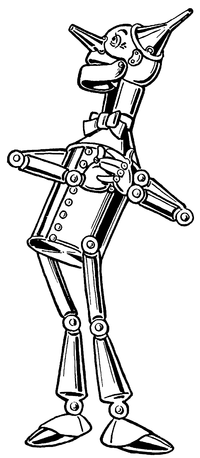
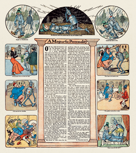
In The Wonderful Wizard of Oz, W. W. Denslow gave the Tin Woodman a skull-shaped head.

Of course, the long nose and ears riveted on that dome, as well as the lively eyes, make it possible to overlook the resemblance most of the time. But the rounded cranium and hinged jaw are quite reminiscent of fleshless human anatomy.

John R. Neill followed Denslow’s model in his illustrations for Ozma of Oz and Dorothy and the Wizard in Oz. As in the series’s first book, the tin man’s head bulges out at the back.

However, in The Marvelous Land of Oz, published before those two titles, and in all the Oz books that followed them, Neill used a different character design, with a cylindrical head. The neck varied at first, but eventually settled on the vague sort of attachment Denslow has used.

In most of those books, when the Tin Woodman takes off his funnel cap, we see that the top of his head is a rounded dome. Neill used the same design for Captain Fyter, the tin emperor’s doppelgänger in The Tin Woodman of Oz (1918).

Toward the end of his career, starting with Ozoplaning with the Wizard of Oz (1939), Neill made yet another variation: he drew the tin man’s head as flat on top, like a tin can. I suspect Neill was out of practice drawing his Tin Woodman; Ruth Plumly Thompson made little use of Baum’s more mature male characters.

I review this history to acknowledge that even within the Oz books there’s a significant variation in the Tin Woodman’s character design. On top of that, we have the costumes created for David Montgomery and Jack Haley, which have to allow a man to fit inside. Thus, people can imagine many things when they think of Nick Chopper.

Lots of comics artists like to depict the Tin Woodman as a robot. That’s doesn’t really fit his origin, in which he’s a living man whose body is gradually replaced with tin parts, and it leaves less room in the saga for Tik-Tok, an actual robot. But some artists just love drawing robots.

One example of that trend is David Hutchison in his Oz: The Manga series, as shown at right. His Tin Woodman’s head is a smokestack, and the robotic characterization extends to gear-shaped speech balloons.

Skottie Young avoided that temptation in helping to adapt the series for Marvel Comics. Indeed, his character design plays up the characters’ old-fashioned, rural beginning. (The man harvested wood, after all.) The tin mustache is reminiscent of L. Frank Baum himself.

And I have a hard time warming to the result. I think the problem for me is that as colored in a pale, tinny way, the mustache looks white. The character’s smooth round head and old-fashioned style reinforce that impression. As a result, this Tin Woodman always looks to me like an old man.

Based on Neill and Denslow’s art, and Baum’s writing, I think of Nick Chopper as a man in his twenties, preserved agelessly by being made into tin (and by living in Oz). Though the Tin Woodman has excellent and kind instincts, and matures somewhat over the series, he’s not old enough to have become wise. He makes mistakes and still regards his appearance with more than a little vanity.

I have trouble imagining the Tin Woodman as a Richard Farnsworth type, much as I admire that actor and some of the characters he’s played. Of course, it’s better than a robot.

21 November 2011

Daredevil and the Family Circus

A day after analyzing some big panels in which a single character appears multiple times, I read Tucker Stone’s Comixology interview with scripter Mark Waid highlighting this double-page spread designed by Marcos Martin for a recent issue of Daredevil.

Waid explained:
I said "look, I need the two of them in a street scene in the glory of all of New York". I used that Superman Vs. Muhammad Ali book as an example for him, that famous two-page spread that Neal Adams drew of the city. . . . It's an amazing drawing. And we needed something of that sensibility. And then I said I was sorry and that I would pay him back for it in the years to come. And you saw what he did. He turned an establishing shot into the Family Circus. And I mean that in a good way!
Stone notes that Martin did similar things in recent issues of Captain America and Spider-Man. I recall another example in Logicomix, by Apostolos Doxiadis, Christos H. Papadimitriou, and Alecos Papadatos.

Waid refers to the well-known “dotted line” Sunday strips of Bil and Jeff Keane’s Family Circus. Those are different, however, usually showing the moving character only at the end while preserving his path across a landscape with a dotted line.

In many ways this multiple-figure image works like those I discussed yesterday (and not just because, technically speaking, it appears in a Daredevil comic). The action moves left to right, background to foreground, helping us English readers to arrange the moments in chronological order. Having a horizontal space to work with probably makes that easier. In addition, both approaches involve maintaining the same basic mood throughout the scene.

Notably, the individual vignettes on this spread are visually separated by areas without balloons or major characters. We can thus insert mental gutters between the moments. In contrast, the multiple figures in yesterday’s panels often overlapped each other, signaling how we should consider them as all part of a single quick series of movements.

(The panel above displays another way of “showing the invisible” for Daredevil, who’s blind but has enhanced senses and radar due to one of those convenient early-1960s accidents with radioactivity. The square boxes popping up around the scene communicate what he’s hearing, smelling, and otherwise sensing.)

20 November 2011

Eleven Nightwings in One Panel

Earlier this month Miguel Rosa at Comics Without Frontiers set himself to “find a panel that shows a character doing multiple actions.”

This was because Devin Grayson had advised novice comics scripters to be sure they ask artists to depict only one action per panel, something she had to learn early on. In that respect, comics panels are not like shots in a movie.

Rosa found two examples of multiple-action panels from Frank Miller’s Daredevil. Yet another appears in this month’s Nightwing, drawn by Eddy Barrows:

There are also plenty of examples in the Flash comics: a speedster moves so fast that he or she appears in several places at once (yet another form of “showing the invisible”). But the relative rarity of such panels supports Devin Grayson’s point, that generally comics scripts need to specify one moment per image.

Artists pull out the technique of showing one person several times in one big panel to portray that character’s exceptional speed (as with the Flashes) or exceptional grace (as with Nightwing and Daredevil). Those images achieve their power because they’re unusual, and break the expected rules.

Furthermore, those panels almost always show only the main character doing multiple actions, and that character has a single goal and mood throughout. It would be much harder for one image to comprehensibly show two characters reacting to each other multiple times, or changing goals or emotions as they move.

Occasionally artists use the technique symbolically, as in the lower example showing how Dick Grayson grew up. This particular image demands that readers already know that history, however.

To make such panels easier to interpret, as Rosa’s examples and the picture above show, colorists usually render most of the figures in lighter shades. Motion lines can also guide our eyes from one figure to another in the proper order.

(The larger point of Rosa’s post is about how motion lines are vanishing from recent American superhero comics, along with other “show the invisible” techniques. He complains that pencilers are acting as “nothing more than glorified illustrators” rather than using the form’s full potential.)

19 November 2011

Eleanor Davis Shows the Invisible

I can’t keep writing about how comics “show the invisible” without pointing to Eleanor Davis’s delight-filled The Secret Science Alliance and the Copycat Crook. It’s a wonderful compilation of such techniques deployed for lively storytelling, and I’ve been meaning to mention it for months.

On pages 49-56 alone, I spot the following:
  • speech balloons, including variations for shouting (two types), electronic communication, machine readouts, interrupted communication, and hysterical laughter, along with boldface italics within speeches for emphasis.
  • cutaway views.
  • sound effects.
  • titles incorporated into the page design.
  • thought balloons.
  • labels for objects, including one listing the contents of a refrigerator and another describing an important notebook.
  • “wafterons,” Mort Walker’s name for the squiggly lines rising like hot vapors to indicate aromas.
  • “dites,” Walker’s term for the straight lines cartoonists use to indicate a smooth surface.
  • inset picture of something that the characters within the scene have lost (well, it’s invisible to them at that moment).
  • diagrams of devices that a character is thinking of.
  • paths showing the panel reading order as panels are stacked on the left.
  • motion arrow and manga-style motion label (“FLIP!”) together.
  • filmstrip displaying a digital recording, along with caption explaining that this format “looks cooler.”
Finally, page 57 provides a symphony of visual tricks in only five panels: speech and thought and yelling balloons, cutaway view, explanatory labels, sound effects, an oversized intrusive narrative caption, and manga-style motion labels.
That plethora of techniques is appropriate for this story, which celebrates the secret knowledge of science. The visual language of comics is, after all, a code for savvy readers. And while there’s a lot happening on every page, there’s also a lot happening in the characters’ heads.

Interestingly, Davis rarely uses motion lines or variations on what Walker calls “emanata” to show strong emotion until the climactic pages of her book. Only then does she pull them out of the cartoonist’s toolbox to depict the faster action and higher stakes.

18 November 2011

“The utter eradication of thought balloons”

Once established (as discussed yesterday), thought balloons became a valuable way that comics creators could “show the invisible,” which I posit is a dimension that sets that form apart from other types of illustrations. That was especially useful when there was a contrast between a character’s thoughts and his actions or speech, as with Cerebus or Peter Parker.

Too often, however, comics creators used thought balloons to tell rather than show, especially for the benefit of young readers and those who had never, ever seen a comic before: “Oh, no! Once again my ring won’t work against anything yellow! I must think of something else before...” (I exaggerate, but only a little.)

In the early 1980s, artist David Lloyd and writer Alan Moore were discussing a new feature for the magazine Warrior in their native Britain. This was meant to be a more sophisticated adventure for adult readers, and its main character’s plans and motives were opaque. Moore wrote of that planning:
Dave was giving me his ideas as to how he actually wanted to approach the strip in terms of layout and execution. These included the absolute banning of sound effects, and, as an afterthought, the utter eradication of thought balloons into the bargain.

As a writer, this terrified me. I wasn’t so much bothered about the sound effects, but without thought balloons, how was I going to get over all the nuances of character that I needed to make the book satisfying on a literary level? All the same, there was something about the discipline of the idea that fascinated me, and while dropping off to sleep at night I’d find it nagging away somewhere in the recesses of my cerebral swamp.

A couple of days later I wrote back to Dave telling him...that not only would we do without thought balloons and sound effects but I was prepared to get rid of most of the caption boxes as well and just rely entirely on pictures and dialogue.
The result was V for Vendetta, and a more cinematic approach to comics storytelling. There may well be earlier examples of mainstream comics creators deliberately doing without so many of their standard narrative tools, but this approach was most influential. That’s because Moore, getting over his initial reluctance, embraced the approach and carried it with him to Watchmen.

Meanwhile, a bunch of American comics creators, including Marv Wolfman, John Byrne, and Frank Miller, were experimenting with first-person narration in captions instead of third-person narration. Those captions offered a space for internal monologue separate from thought balloons. The popularity of the results, particularly Miller’s Ronin and Dark Knight Returns, worked with Watchmen and V for Vendetta to make thought balloons seem unsophisticated. And soon they were utterly eradicated.

17 November 2011

“Characters were constantly speaking to themselves out loud”

At a new blog called Comics Without Frontiers, Miguel Rosa traces the development of thought balloons in the first year of Superman and Spirit comics.

[Rosa started his blog to promote discussion of comics from outside the US, but a lot of the postings are on the standard American superhero stories. Not that there’s anything wrong with that.]

This posting complements my discussion of the same topic, which watched how thought balloons developed alongside whisper balloons since early on characters often seemed to be voicing asides to the audience.

Rosa writes:
I realized that one of the reasons why thought balloons were seldom used in those years was because the characters were constantly speaking to themselves out loud, like in this panel from Action Comics #1. In many of these cases, thought balloons should have been used instead. Rather than speaking out loud, a thought balloon containing a line like, “The cops are coming; I better change to my civilian clothes!” would make more sense.
He also reprints a delightful Spirit panel which shows the hero trapped under water and saying out loud: “I...can’t... hold...my...breath... much...longer!”

Soon, however, the thought balloon became a standard part of American comics punctuation, avoiding such unrealistic moments. Because superhero comics had to be realistic.

TOMORROW: Who started the thought balloon’s hibernation over the last thirty years?

15 November 2011

Cartoon Art Museum Has Gone to Oz

Last week the Cartoon Art Museum in San Francisco opened an exhibit on Oz comics. It draws heavily on the collection of Peter Maresca, publisher of Sunday Press (which would be a small press except that its books are so big).

Early comics artists in the exhibit include Walt McDougall (working with L. Frank Baum), W. W. Denslow (competing with him), and John R. Neill (before becoming Baum’s main illustrator). More recent ones include Eric Shanower, Skottie Young, Anna-Maria Cool, and Ramona Fradon.
Among the pages on display is one Eric Shanower drew for Oz-Story magazine a while back, showing moments in the Oz series illustrated in the styles of different famous cartoonists.

I visited the Cartoon Art Museum on my last trip to San Francisco beyond the airport, and admired how much good stuff it displayed in a small space. Definitely worth a visit. [Hey, there’s Jerry Robinson!]

14 November 2011

“Mine is full of slightly antiquated, pre-contemporary language”

The British publishing magazine The Bookseller has run an interview with debut fantasy novelist James Treadwell (also Godson’s Dad). Although his book Advent features teens as central characters, Treadwell agrees that it’s not typical YA:
The central theme of magic in the real world is reminiscent of the classic fantasy series The Dark is Rising (a sequence of seven [sic] books first published in the late 1960s and 1970s), and it’s no surprise to hear Treadwell describe those books as “a huge part of my mental geography growing up—I loved them”.

Advent is for a slightly more sophisticated readership though, and Hodder is pitching at both the adult and older YA market. With the rise in the appeal of fantasy for a mainstream audience, Hodder is hoping for a Jonathan Strange & Mr Norrell-style crossover. . . .

Treadwell doesn’t think his former academic career—he was a Romanticist specialising in 18th and 19th-century writers—has had a direct influence on Advent, but he does acknowledge that spending so much of his adult life reading will have an effect on his own writing: “Any writer has an internal echo chamber, full of bits of phrases and words and language. Mine is full of slightly antiquated, pre-contemporary language, because that’s what I read for a long time.”

Treadwell says while he loved the idea of writing for teenagers when he started the novel, “I realised that these are not young adult sentences. My hand wouldn’t do it. I’m quite prolix. I write long sentences, I don’t write straightforward fast-moving plots . . . but I would love teenagers to read it, and I hope that they will.”
The great thing about the teen years, of course, is that book-lovers can read both well above and below their stated age range.

13 November 2011

One Robin will not be enough.”

Batman: The Brave and the Bold, #13, issued this week, features six former and future Robins brought together by the convenient mystical powers of the Phantom Stranger. As with most of DC’s other semi-parodic superhero comics for young readers, it’s a simple, self-contained story that rests on and reinforces the archetypal characters.

In fact, the adventure stays simple to expand the space for interaction among the different Robins, their characters neatly summarized for us later in narrative captions. Batman is so archetypal that he’s actually back in Crime Alley witnessing a mugging (as in “To Kill a Legend,” Detective Comics, #500). And precisely because he’s Batman, he can breathe in space keep his sanity in a Lazarus Pit. Nightwing, ever optimistic, figures as much.

Scripter Sholly Fisch chooses to show Dick Grayson early in his Nightwing career, which makes him the obvious leader of the Robins and visually distinct from the rest. Penciler Rick Burchett differentiates the teens in red and green by picking up the important details of their canonical costumes. (In three panels, though, the colorist has mixed up the second Jason and Tim.)

Reading this magazine led me to two observations. First, regardless of DC co-publisher Dan DiDio’s public statements, the company’s creative people understand that Stephanie Brown was a Robin. Fisch’s script puts the denial of that obvious fact into the mouth of a ten-year-old boy, where it belongs.

Second, as I said about Tiny Titans, I’m puzzled by how young readers are supposed to respond to most of this comic’s references to the DC canon. I’m not talking about, say, the title spread’s homage to “Robin Dies at Dawn!”—that slips perfectly into this story without any rough edges sticking out.

But twice gags depend on knowing that Damian was once heir apparent to the head of the League of Assassins, a fact available in the regular Batman comics (the ones with people’s heads and faces getting chopped off) but not in this issue. At another point Carrie reels off some baffling slang, but the story never explains that she’s the Robin from furthest into the future(s).

As with Tiny Titans, such allusions left me feeling this comic isn’t really for kids. Its age label is just a screen that lets us older fans enjoy simple, archetypal stories.

12 November 2011

Pingback

The following review originally appeared at Slashdot. Later it was copied onto Amazon, as of this week 10,196 of 10,568 people found it helpful:
Using deft allegory, the authors have provided an insightful and intuitive explanation of one of Unix's most venerable networking utilities. Even more stunning is that they were clearly working with a very early beta of the program, as their book first appeared in 1933, years (decades!) before the operating system and network infrastructure were finalized.

The book describes networking in terms even a child could understand, choosing to anthropomorphize the underlying packet structure. The ping packet is described as a duck, who, with other packets (more ducks), spends a certain period of time on the host machine (the wise-eyed boat). At the same time each day (I suspect this is scheduled under cron), the little packets (ducks) exit the host (boat) by way of a bridge (a bridge). From the bridge, the packets travel onto the internet (here embodied by the Yangtze River).

The title character -- er, packet, is called Ping. Ping meanders around the river before being received by another host (another boat). He spends a brief time on the other boat, but eventually returns to his original host machine (the wise-eyed boat) somewhat the worse for wear.

If you need a good, high-level overview of the ping utility, this is the book. I can't recommend it for most managers, as the technical aspects may be too overwhelming and the basic concepts too daunting. . . .
What I’d really like to know is why the book was titled The Story about Ping instead of The Story of Ping.

11 November 2011

Billion for the Guy?


Over at Boston 1775, I’ve been tracing how a particular stylized depiction of Guy Fawkes has become an international symbol of political protest.

It’s a path that leads from a terrorist plot against the entire British government to festivals of patriotic misrule in the 1700s through boys’ sports in the 1800s and Alan Moore and David Lloyd’s V for Vendetta comic to an internet meme and back into the political world. The journey started here.

10 November 2011

Grand-dad the Mummy

I admire people who donate their bodies for science, but Alan Billis is the first I know who donated his body for history. Or rather the scientific study of history.

A British cab driver who was diagnosed with a terminal lung cancer, Billis decided to answer a BBC call for someone to volunteer a body to mummify in the style of ancient Egypt. The BBC reported:

Mrs Billis took it all in her stride, explaining: “He just said, ‘I’ve just phoned someone up about being mummified’.

“I thought, ‘here we go again’. It’s just the sort of thing you would expect him to do.”
It looks like an anonymous Maryland donor did the same in 2001. But this time, in the style of the modern west, the process was filmed and broadcast on TV in Britain a week before Hallowe’en.

09 November 2011

Finding Inspiration for Hellbound II

Hellbound II is an anthology of independent horror comics being published by the Boston Comics Roundtable. It’s currently available in a “Limited Art Edition,” and later will appear as a conventional paperback. The deluxe version consists of two softcover volumes in a box, both covers and the box itself made from handmade paper with silkscreened cover art by Jesse Lonergan.

Andy Wong and I created a story in Hellbound II titled “RobMeBlind.com.” Here’s a bit from a joint interview by Steve Cartisano, one of a series with Hellbound II creators:
John, what inspired you to write this story?

At a BCR meeting, Andy Wong was chatting with a small group—Lindsay Moore, Carl Tsui, and me—about a website called StealMyStuff.com. That’s a real website which works a lot like the one in our story, connecting people’s Facebook updates about going out of town with their street addresses as a warning to manage your privacy settings. I joked about how that could lead to something worse. That evening I typed out a first draft of the script to send back to the little group. Andy said he wanted to draw it, which struck me as right and proper because he’d served the ball to begin with.

Andy, is that what drew you to this story?

I enjoyed the fact it spouted from a conversation I had with John. I wanted to try my hand at the horror genre, since I usually draw silly slice of life comedies. There was also this growing hunger to draw some crazy monster designs.
It looks like StealMyStuff.com is no longer active, but you can get the same idea from ICanStalkU.com. Or this New York Times article about the personal information embedded in some digital snapshots. Isn’t it wonderful how the modern world offers opportunities for chills that previous generations never knew?

08 November 2011

The Influence of Scalawagons

Scalawagons of Oz might well be John R. Neill’s most influential book. Not because it’s good. In fact, it’s the worst of the three or four Oz books Neill wrote. He was a talented illustrator, but had no apparent sense of narrative structure.

Among Neill’s other Oz books, The Wonder City of Oz was rewritten by a Reilly & Lee editor, and A Runaway in Oz was rewritten (with far more attention to the original story) by Eric Shanower.

Neill’s Lucky Bucky in Oz benefits from a conventional Oz-book narrative: An American child cast into fairyland by random disaster gathers companions and makes his adventurous way to the Emerald City. However, despite having such a simple plot laid out, Neill managed to make his timeline loop back on itself in an impossible way.

Even among that bunch, however, Scalawagons of Oz is the worst. Events happen randomly. Hardly any character is really likable. The storyline, such as it is, accumulates the tension of a sagging strand of chewing gum.

Furthermore, the book introduces mass-manufactured sentient automobiles into Oz, reason enough for some fans to reject the book. While L. Frank Baum established that Oz had electricity, and even some electrical communications systems (controlled by the elite), he made sure not to include modern transportation technology: no trains, steamboats, aeroplanes, or motorized runabouts. Having to travel by foot or Sawhorse guaranteed that people had adventures. Those cars called Scalawagons (Neill tried too hard on his puns) could have ruined life in Oz for readers. Therefore, none of Neill’s official successors as Oz authors, and few of his unofficial ones, have incorporated the Scalawagons into their stories.

So how is that book influential? Because, as David Maxine recently wrote at Hungry Tiger Talk, reading it pushed other authors into writing their own, better Oz books. The first was Rachel Cosgrove Payes, then a housewife biologist, who offered Reilly & Lee The Hidden Valley of Oz in 1951. About a decade later, she embarked on a long career writing other types of novels.

As the second example, David’s posting displays a copy of Scalawagons inscribed by three-time Newbery Honor winner Eloise Jarvis McGraw with these words:
This book…came into the possession of my daughter (and co-author) Lauren Lynn McGraw, who was reading it one day in 1962, looked up at me and said, ”We could write a better Oz book!” Whether we did or not is not for me to say, but we tried
The McGraws’ Merry Go Round in Oz (1963) was one of the best in the series, certainly by conventional measures of writing style.

Finally, a less worthy example of Scalawagons’ influence might be a curious story from Wow Comics, #48 (1946), which shows Mary Marvel fighting robots shaped like Oz characters. Alongside the easily recognized Scarecrow and Tin Woodman is a strange creature called the What-is-it. As David pointed out in reprinting this tale in Oz-Story, #2, that creature looks like the main villain in Scalawagons, published five years earlier and quite possibly still sitting unsold on a bookstore shelf.

07 November 2011

Trying to Claim Fantasy Literature for Christianity

Reviewing two fantasy novels in the Jewish Review of Books back in 2010, Michael Weingrad asked “Why There Is No Jewish Narnia.” However, he starts with C. S. Lewis and J. R. R. Tolkien, which naturally points the discussion in a particular way. (We could do worse than ask whether there have been many Jewish dons at Oxford who felt secure enough to publish fantasy novels.)

Then Weingrad dismisses respected counterexamples by writing:
Haven’t modern Jewish writers, from Kafka and Bruno Schulz to Isaac Bashevis Singer and Cynthia Ozick, written about ghosts, demons, magic, and metamorphoses? But the supernatural does not itself define fantasy literature, which is a more specific genre. It emerged in Victorian England, and its origins are best understood as one of a number of cultural salvage projects that occurred in an era when modern materialism and Darwinism seemed to drive religious faith from the field.
No, that’s not what defines fantasy literature. It may be part of the definition of “high fantasy,” with its emphasis on magic-infused lands and epic battles between good and evil, but that’s only one part of the corpus. Weingrad tries to define fantasy as wholly separate from science fiction, where there are, he acknowledges, many Jewish authors. He also disregards all fantasy storytelling outside the prose form: no comics, no movies.

Weingrad’s critique immediately prompted replied from more knowledgeable critics like Farah Mendelsohn, Abigail Nussbaum, and Spencer Ackerman.

D. G. Myers just followed up with a Commentary essay titled “Fantasy Is a Genre of Christianity.” This is an even less tenable thesis, explored in less depth at less length. Myers can manage even that much only because he gets to define his terms: “The bedrock premise of fantasy, which cannot be waived without voiding the genre, is the existence of a spirit realm.”

There’s no “spirit realm” in, for example, Mary Norton’s The Borrowers, Walter R. Brooks’s Freddy the Pig, or E. B. White’s Stuart Little—only unseen corners of everyday life. Myers’s definition also excludes all fiction that provides a non-mystical explanation, however scientifically stretchy, for the unfamiliar.

Furthermore, the “spirit realm” is neither the creation nor the exclusive property of Christianity. It’s Platonist. The philosophical movement later labeled “Middle Platonism” infused early Christian theological writings, but its ideas are independent of that faith.

06 November 2011

Robin Around the Web This Week

At Comics Should Be Good!, Brian Cronin asked for reader suggestions of the Greatest Tim Drake Stories Ever. That evolved into the Greatest Robin/Red Robin Stories Ever.

Some patterns stood out:
  • Six of the top ten were written by Chuck Dixon.
  • Only two of those ten appeared in the last ten years. Most date from the early and mid-1990s.
  • Many crucial events in Tim Drake’s career (his mother’s death, meeting Spoiler, joining Young Justice, joining the Teen Titans, his father’s death, shift to Red Robin, deducing that Bruce Wayne was lost in time) don’t appear in any of these stories. 
Cronin doesn’t include vote counts, and I may be projecting here, but the level of commentary on those posts makes me suspect fans had a hard time coming up with top ten lists. Yet the same website had another fan poll that placed Tim Drake as DC’s eighth best character this year. (Dick Grayson, coming off a year in the batsuit, came in a solid #3.)

The character of Tim Drake, as a symbol and as a member of the shifting casts of people around Batman and/or of DC’s young heroes, may well be better and more beloved than individual stories about him.

Elsewhere, the artists at Comic Twart focused on Damian Wayne; the panel above comes from Evan Shaner. It looks like some contributors knew much more about the character going in than others. (“Gerads told me this is all that kid says.” “So apparently Damian Wayne is 10.”) The resulting exercise might therefore be less successful than it could have been.

The group’s tribute to Bucky Barnes seems more sure-footed. I especially like Tom Fowler’s mash-up of the finale of Dr. Strangelove with Baron Zemo’s rocket.

05 November 2011

Brother, Can You Paradigm for the Tollbooth?

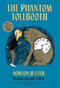
With all the attention flowing to The Phantom Tollbooth on its fiftieth anniversary, I decided to do what Peter Sagal warned against: to reread the book as an adult.

The copy I found on my shelf was issued for the thirty-fifth anniversary, with a foreword by Maurice Sendak. I was surprised to find that my copy is also autographed by author Norton Juster and artist Jules Feiffer. I’ve met Juster once or twice, but never asked for his signature, and I’ve never met Feiffer. I guess I bought a copy they signed for Books of Wonder or another store, but I’d prefer to think of those autographs as a mysterious apparition.

Sagal’s warning and my own memory of first reading the novel (I vaguely liked it, didn’t love it) meant I wasn’t subject to crushing disappointment on rereading. Juster’s play with words and logic is clever throughout, but it’s a single note struck over and over.

The young hero Milo is quite a blank slate; feeling bored is hardly a galvanizing personality trait. At least he’s not a paragon, however. As in some other fantasies written for the same age range, the protagonist’s lack of a strong, distinct personality might make it easier for young readers to project themselves into his adventures.

I had long thought of The Phantom Tollbooth as a portal fantasy, but I was struck by how closely the book followed that standard map:
  • Milo goes through an unusual opening to a fantasy world. That portal’s a tollbooth, but it might as well be a mirror, a wardrobe, or a cyclone.
  • Milo’s status as a newcomer allows the characters of that world to explain it all for the benefit of the readers.
  • There’s something wrong in that world (Princesses Rhyme and Reason are missing), and Milo gets the mission to fix it. Because the fate of the world must always depend on an eleven-year-old who pops up out of nowhere.
  • Over the course of a journey, Milo accumulates companions (Tock, the Humbug), knowledge (so many valuable lessons about life), and tools (a stolen sound) that allow him to fulfill that mission. Whatever was wrong with that world is fixed, and the status quo ante is restored.
  • After a celebration, Milo returns to his own world, more mature and sure of himself than he began.
Next spring, I’ll talk on types of fantasy at SCBWI New England’s annual conference, and I’ll certainly use The Phantom Tollbooth as a paradigmatic example.

04 November 2011

Synesthesia, the Phantom Phenomenon

Leonard Marcus’s interviews for the new Annotated Phantom Tollbooth and the recent New Yorker article by Adam Gopnik bring out what seems to be new information on the source of author Norton Juster’s “nonsense”: it reflected how he actually saw the world as a child.

Juster told Gopnik:
“I had an ailment called synesthesia,” Juster explained, pronouncing the word carefully. “I could only do numbers by colors.” His mind—in a way that will be familiar to readers of the memoirs of that fellow-synesthete [Vladimir] Nabokov—made instant, inescapable associations between a number and a color. “I can still remember a few: 4 was blue, 7 was black, and so the only way I could do math was by associating colors.”
In the novel, at the Dictionopolis marketplace Milo nibbles on some letters, gaining the sensation of tastes. Later he conducts an orchestra that produces colors. And of course the whole book concretizes the abstract.

Some readers, such as Patricia Lynne Duffy in Blue Cats and Chartreuse Kittens: How Synesthetes Color Their Worlds and this article in LinguaPhile, had already recognized that Juster’s text described that mental phenomenon. But I don’t recall him speaking of his experience before.

03 November 2011

The Phantom Tollbooth in Its Time

In a New Yorker article about the fiftieth-anniversary editions of Norton Juster’s The Phantom Tollbooth, Adam Gopnik wrote:
It’s a commonplace of scholarship to insist that children’s literature came of age when it began to break away from the authoritarian model of the moralizing allegory. Yet “The Phantom Tollbooth” is an old-fashioned moralizing allegory, with a symbolic point at every turn.
And that’s why the book can grate on adults like Peter Sagal.

The “coming of age” that Gopnik mentions occurred decades, perhaps a century, before Juster started writing. Such obvious “moralizing allegory” was long gone. Sure, there were still moralizing tales like Betty MacDonald’s Mrs. Piggle-Wiggle (1947-), and William Pène du Bois was about to tackle the deadly sins (1966-). Even today, most people expect novels to leave children with a sense of hope and other subtle nudges in a right direction. But allegorical characters that spell out their valuable lessons about life without a wink—those were as old-fashioned as Pilgrim’s Progress.

The Phantom Tollbooth brought back the form, but its characters have less to say about morals than about intellect. Milo learns to see the world from different perspectives, not to jump to conclusions, and other rules of proper abstract thought. The book depicts using one’s intellect to be as important as much earlier allegories had urged readers to use their piety and/or moral sense.

01 November 2011

A Wizard of Oz by Way of New Delhi

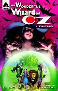
Last week I picked up a copy of the Campfire Classics graphic adaptation of L. Frank Baum’s Wonderful Wizard of Oz. This is one of a long list of public-domain stories brought to the US by Steerforth of New Hampshire and distributed by Random House.

Roland Mann, a veteran of Malibu Comics, is credited as “wordsmith.” Kevin (or K. L.) Jones is the credited “penciler.” All of the other names on the credits page are Indian.

[Comics publishers often print long lists of credits on a copyright page, including company executives with minimal involvement in that title. In contrast, a traditional children’s book usually doesn’t state its editor’s name anywhere. This is another of the curious cultural differences between the two industries.]

Campfire Classics are produced out of New Delhi. Back in 2010, Publishing Perspectives reported: “Among the advantages the company has is the ability to keep most of the work in-house. The company employs a bullpen of 20 full-time artists on staff to do with drawing and coloring.” As a result, a 76-page full-color Campfire book can retail for $9.99.

According to Mann, for the Classics series ”The goal is to stick very close to the original and get young readers visually interested in the work so that they might actually seek the original out.”

For him, that assignment meant reading The Wonderful Wizard of Oz for the first time. His blog shows how he discovered the obvious big differences between the book and the famous MGM movie.

Still, that movie exerted a heavy influence on the visuals of this adaptation. Jones and the bullpen depict Dorothy as an adolescent with brown braids; for much of the book she wears a blue-and-white checked dress. (In the Emerald City she changes into one of the least flattering dresses I’ve ever seen, shown here.)

The Wicked Witch of the West has the green skin and long fingernails that Margaret Hamilton wore in the 1939 movie, but (aside from the scars over her missing eye) has a young and attractive face—a sign of Wicked’s influence.
Campfire is aiming for the American and British markets, to judge by the titles and topics in its catalogue. I rather hoped to find details that struck me as a markedly Indian interpretation of the legend, but didn’t spot any. The biggest departure from the traditional range of Wizard of Oz characterizations is, as this picture shows, the Winkies as little yellow goblins. The lettering is unimaginative, possibly designed to stick as closely as possible to what readers might find in prose books.

As the publisher requested, Mann’s script sticks close to the source material. It includes the Winged Monkeys’ flashback and the visit to the China Country, two episodes that adapters often leave out. It skips only the visit to the family just outside the Emerald City, which offers characterization but not much action.

Indeed, Mann clearly concentrates his limited space on action scenes. The travelers’ confrontation with the Kalidahs takes nearly three pages. There’s a spread and more on Nick Chopper’s transformation into the Tin Woodman through multiple axe accidents, starting with the picture of young Nick at the right.

In contrast, the Wizard gives out brains, a heart, and courage in only three panels covering half a page. Those moments help to define the thematic core of the novel, but the script zips us through them. Similarly, there’s little pause for Dorothy’s sorrow after the Wizard’s balloon flies away.

As a result, I enjoyed moments of this adaptation, and found some of the creators’ other choices interesting to contemplate, but I didn’t think the overall storytelling was emotionally involving or fully successful.

One of Jones’s upcoming titles for Campfire is a comics biography of Abraham Lincoln. Mann, in contrast, is a neo-Confederate, so I don’t think he’ll be working on that one.